Award-winning real estate website designs
With over 1,500 five-star reviews and numerous RealTrends™ awards, Luxury Presence is the leading provider of beautiful, effective real estate websites for agents, teams, and brokers. Check out the portfolio of our most recent website designs.
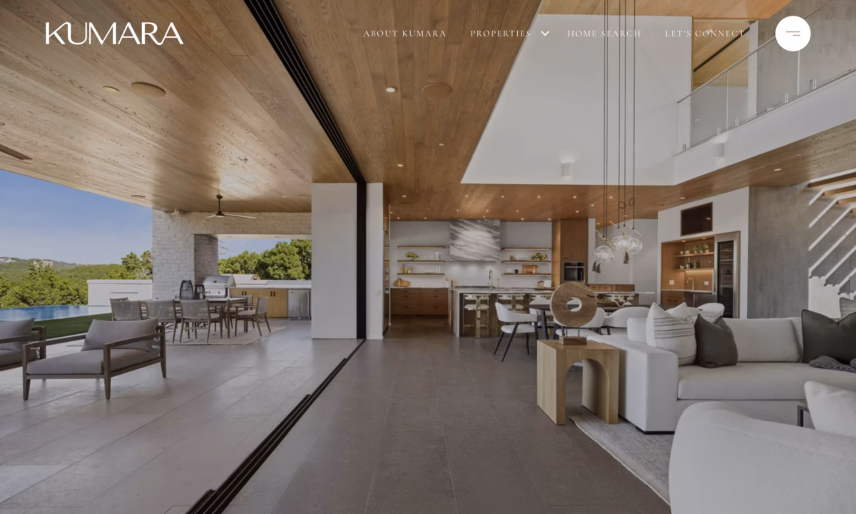
Kumara Wilcoxon
With over $1.3 Billion in sales, Kumara Wilcoxon is one of Austin’s top luxury real estate agents. Kumara’s website reflects her distinguished and elevated brand. With subtle brand elements, a warm color palette, and plenty of video content, the website has an ultra-high-end look while still being inviting.
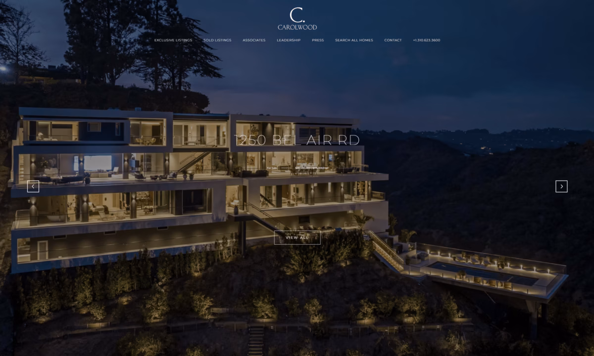
Carolwood Partners
Carolwood Estates is a boutique brokerage located in Beverly Hills that was founded by a team of industry leaders. The custom website conveys the stunning Carolwood brand and combines clean lines with timeless elegance. The website draws attention to the high-end listings Carolwood represents. The website is eye-catching and highly usable, with excellent page speed scores.
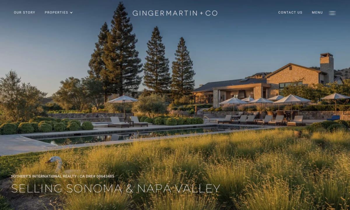
Ginger Martin
Ginger Martin + Co is an experienced, top-tier real estate agent, ranked in the Wall Street Journal Top 100, and with over $3B in all-time sales volume. Their website combines a stunning minimalist design with subtle brand elements to create a high-end look. The incorporation of high-resolution images of stunning properties and an elevated look allow their website to stand out.
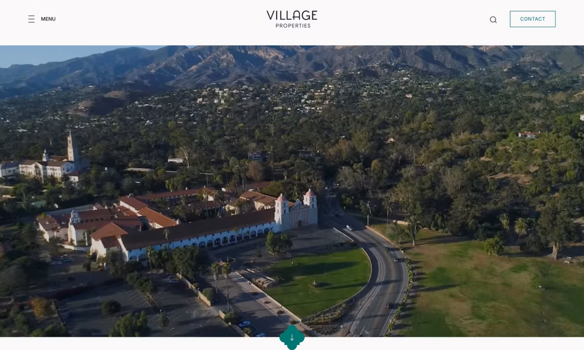
Village Properties
Village Properties, a boutique brokerage in Santa Barbara, has represented more than $20 Billion in sales. The custom brokerage website conveys window-like imagery that gives visitors a glimpse of the stunning properties. It has an elegant, clean, and elevated look that creatively showcases its brand elements and color palette.
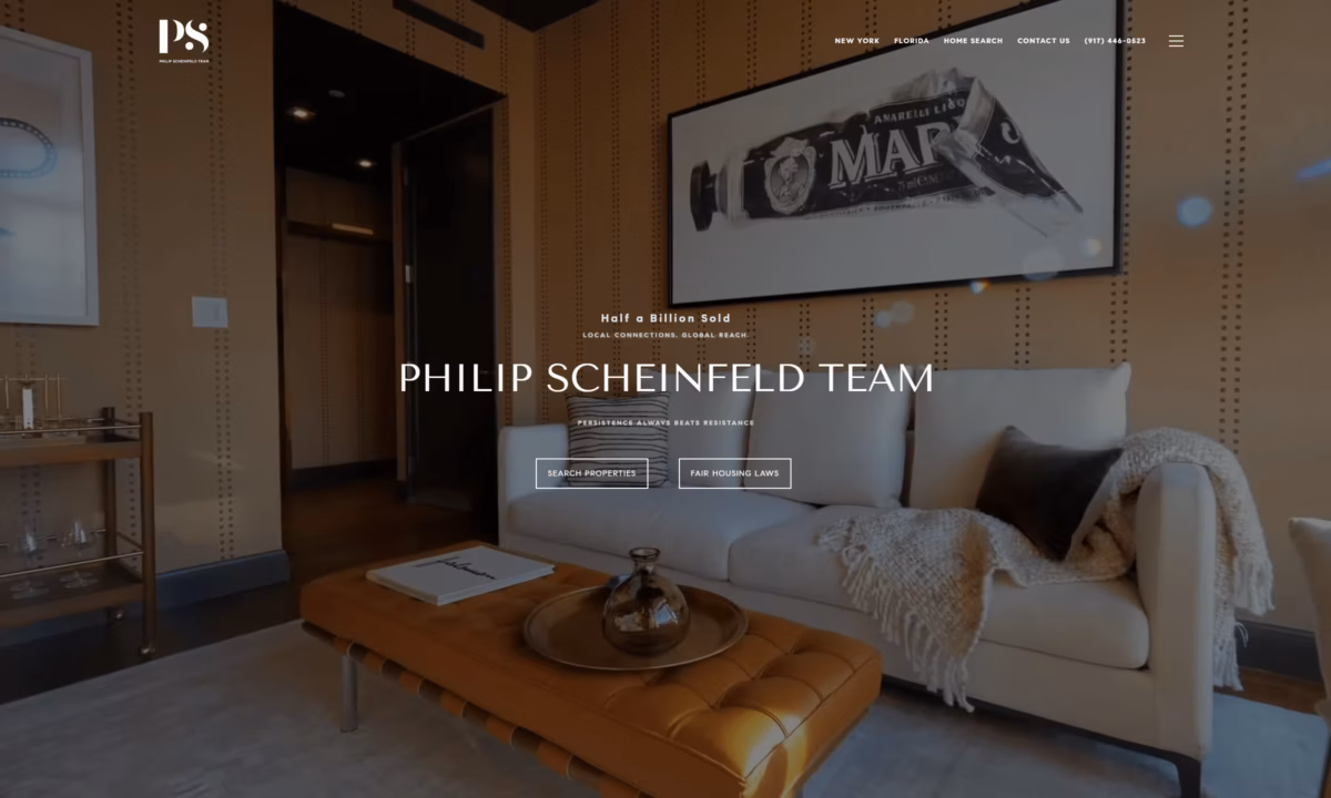
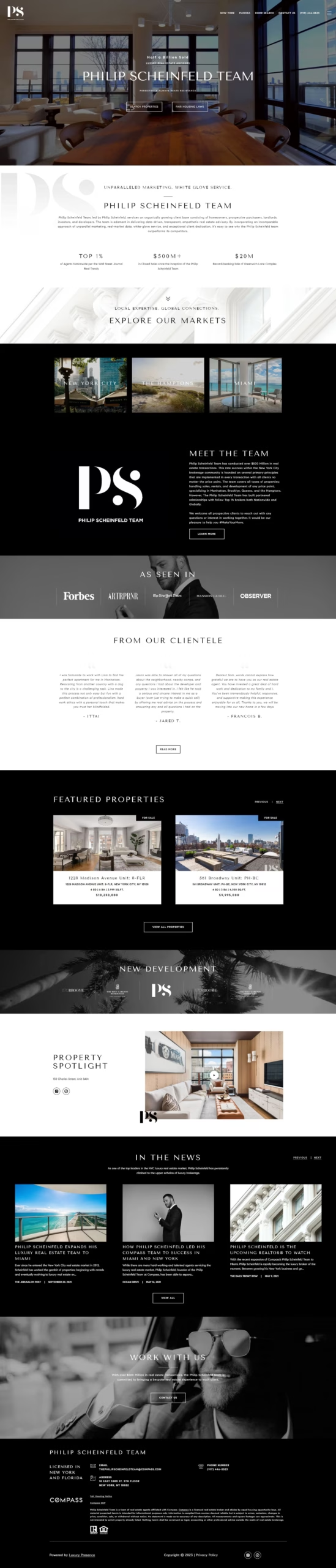
Philip Scheinfeld Team
The Philip Scheinfeld Team has been ranked among the top 1% of Agents Nationwide and has closed more than $500 Million in sales since the team’s inception. The custom website features a modern look with high contrast, eye-catching elements, and elegant incorporation of the team’s brand.
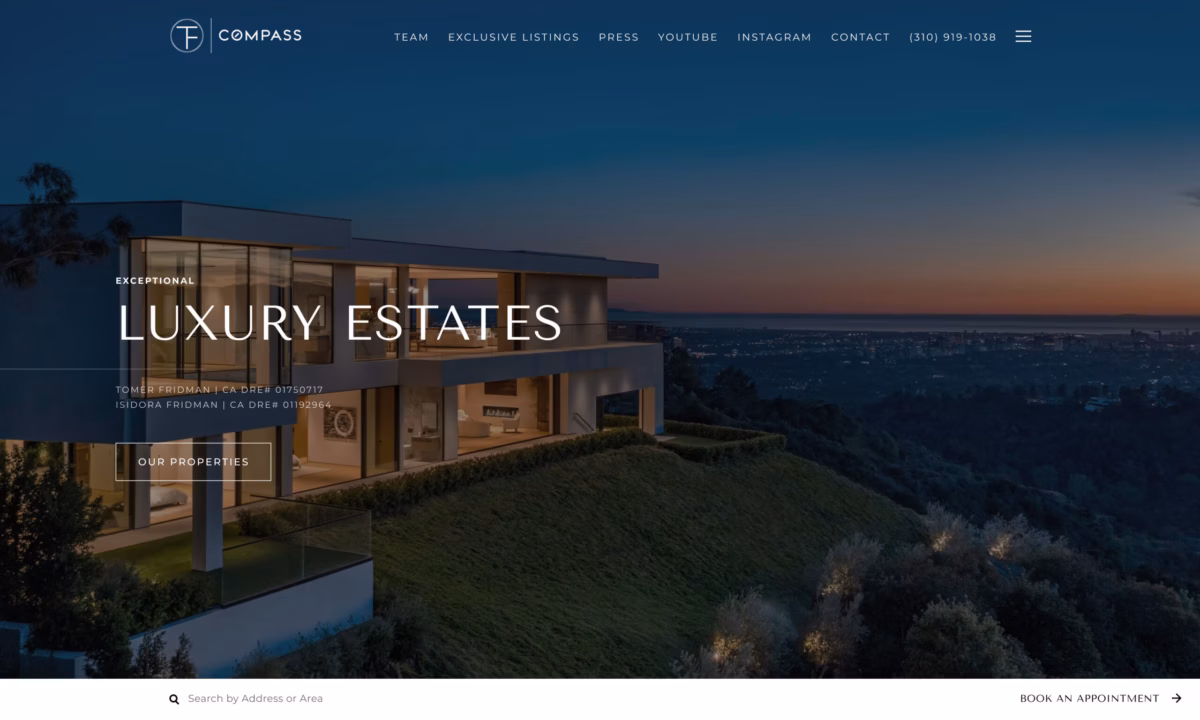
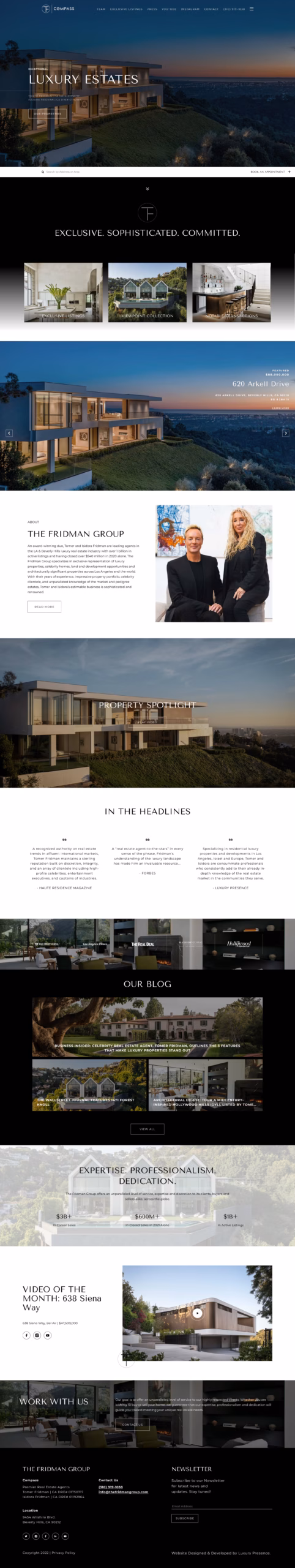
The Fridman Group
The Fridman Group, a highly successful real estate company, boasts an impressive track record with over $3 billion in career sales and $600 million in closed sales in 2021 alone. Their website combines an elegant design with a modern aesthetic. It offers a user-friendly experience and is further enhanced by the inclusion of high-resolution property images, providing visitors with a glimpse into the success of The Fridman Group.
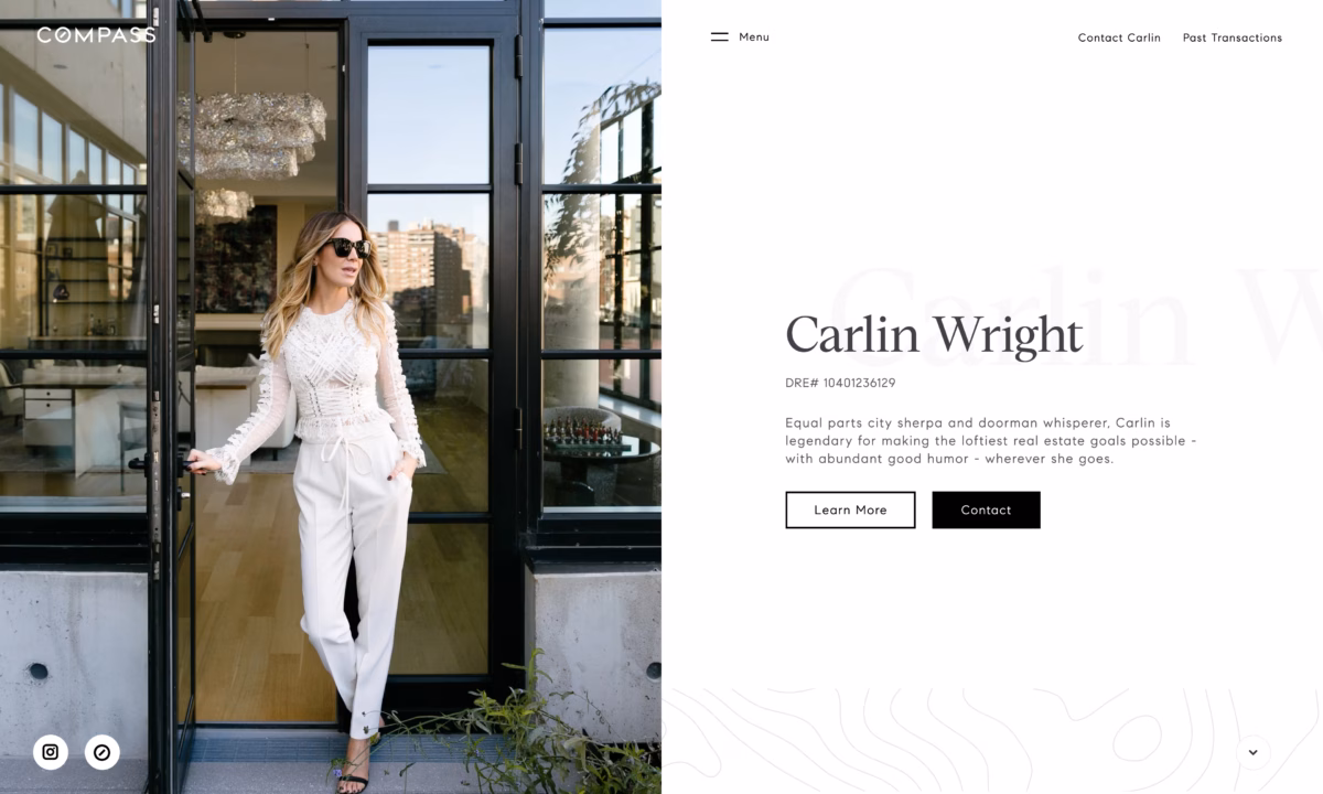
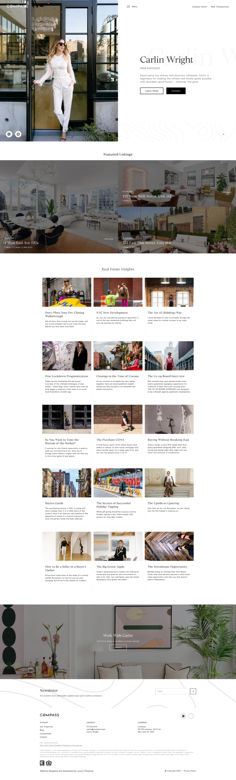
Carlin Wright
Carlin Wright, an accomplished real estate agent with multiple awards to her name, has closed over $250 million in sales. Carlin Wright’s elegant website seamlessly blends her personal style with clean and subtle black-and-white brand elements. The inclusion of real estate market insights highlights Carlin Wright’s expertise and success in the industry.
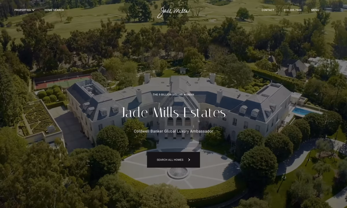
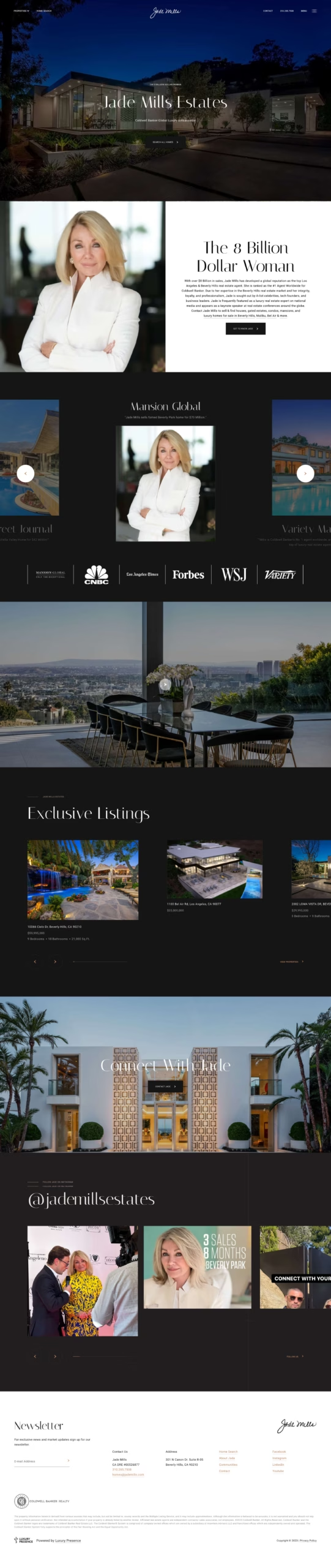
Jade Mills Estates
Jade Mills is a highly accomplished real estate agent, having been inducted into the Inman Golden I Hall of Fame and earning the distinction of Coldwell Banker’s number one agent, worldwide. With over $8 billion in sales, her expertise in the industry is undeniable. The design of her website reflects this, featuring a personalized aesthetic with a luxurious and modern feel. The use of high-resolution property images further enhances the website and captures the attention of clients. Additionally, her website ranks first in Google search results for multiple keywords, further demonstrating her online presence and reach in the industry.
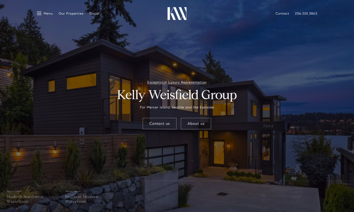
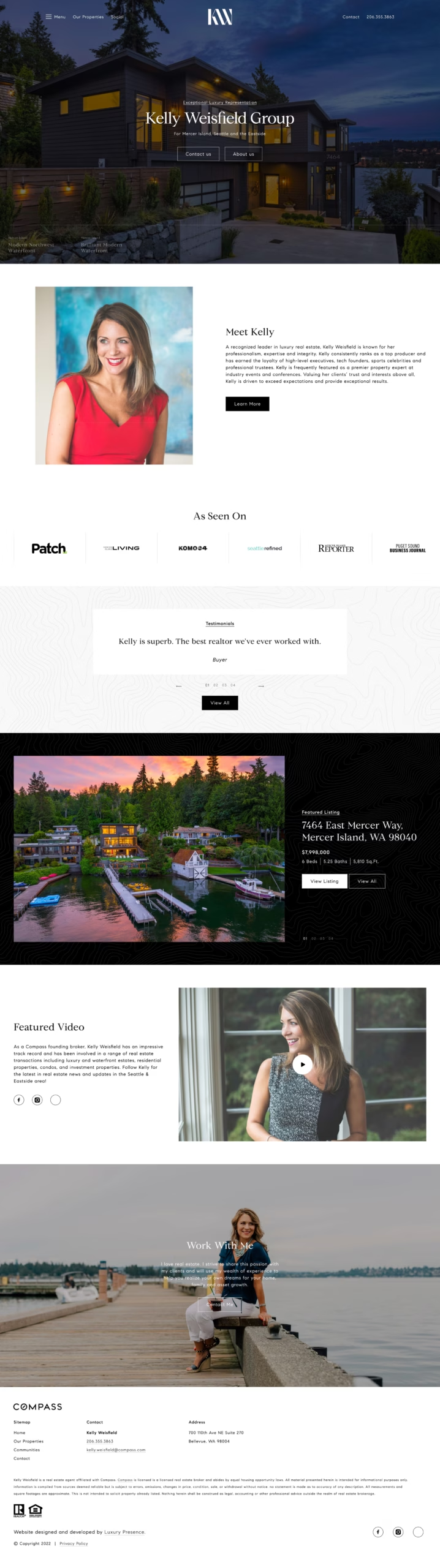
Kelly Weisfield
The Kelly Weisfield Group has established a noteworthy reputation in the real estate industry, earning the loyalty of esteemed clientele including high-level executives, tech founders, sports celebrities, and professional trustees. The group’s website places a strong emphasis on user experience, unique brand, and provides an elevated look that highlights striking properties.
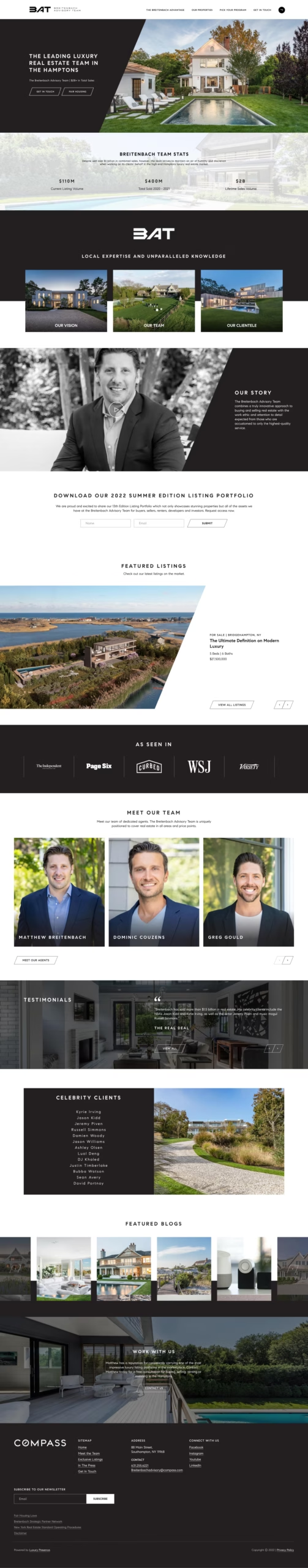
Breitenbach Advisory
The Breitenbach Advisory Team boasts an outstanding lifetime sales volume of $2 billion, with $400 million sold in 2020-2021 and $110 million in current listing volume. The team’s website features a sleek design that combines minimalist and clean aesthetics. The website effectively showcases their stunning properties with a unique branded look, allowing their work to speak for itself.
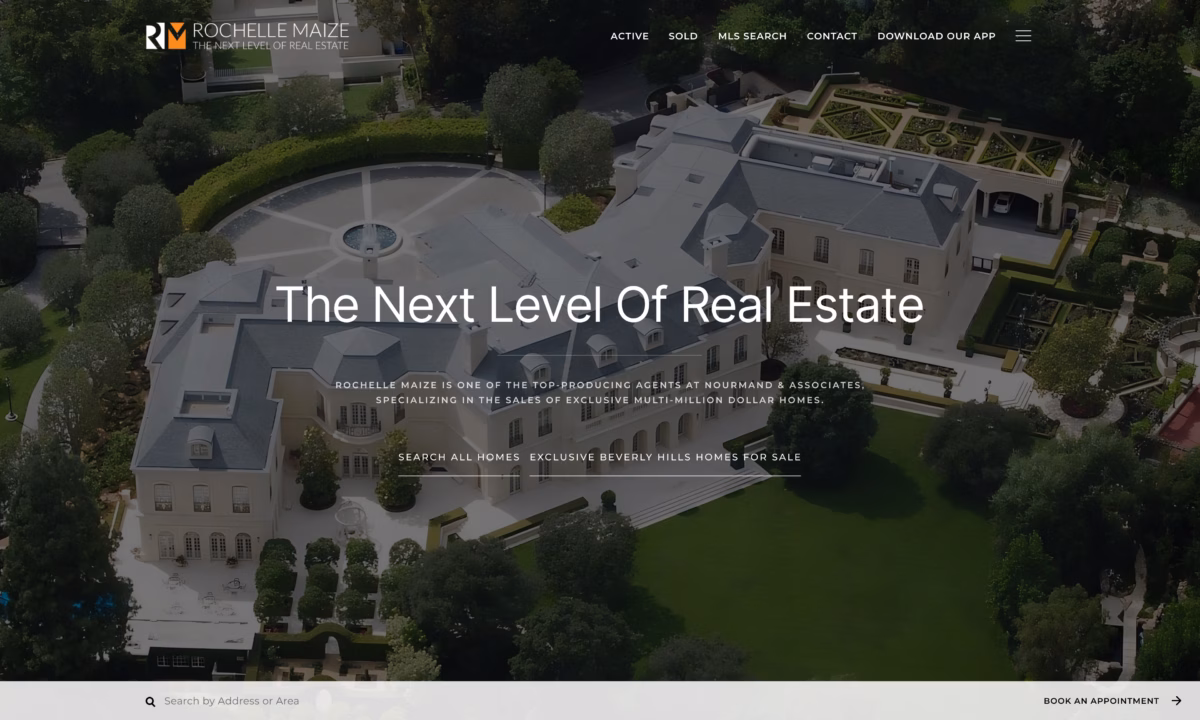
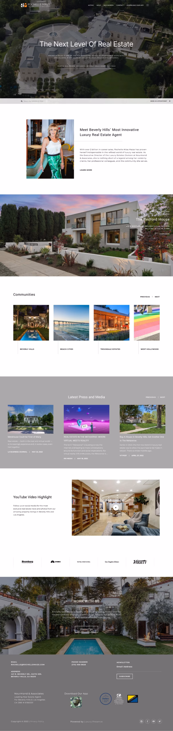
Rochelle Maize
Rochelle Atlas Maize is a prominent figure in the luxury real estate industry, having amassed a remarkable career total of over $3 billion in sales. The website’s design and user experience are a testament to her expertise and reputation in the industry. The visually striking design and user-friendly interface create an elevated look that highlights her outstanding properties.
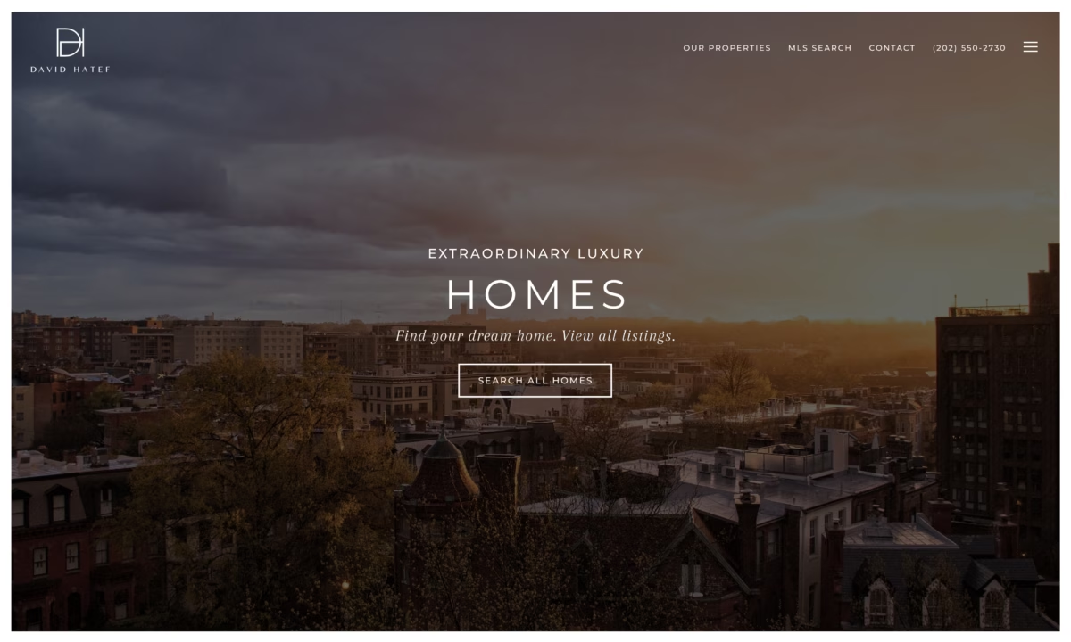
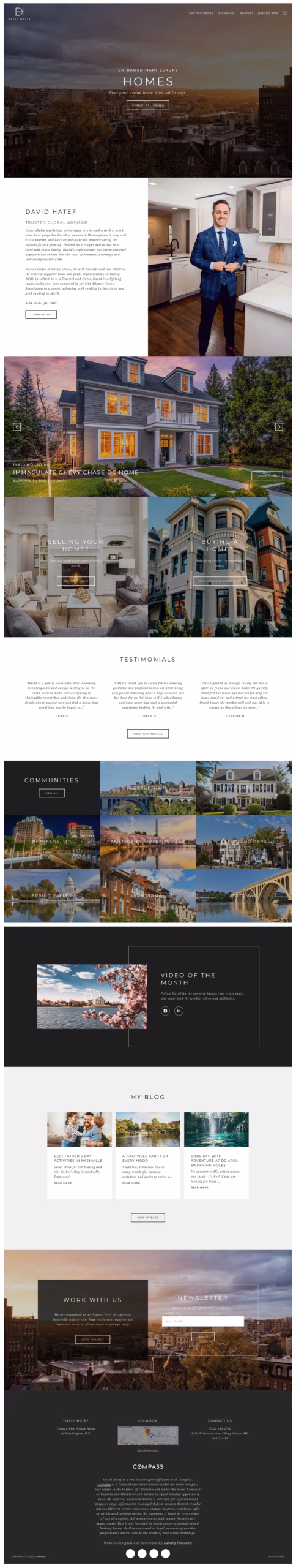
David Hatef
With career sales totaling $100M, David Hatef has earned a spot on the 2021-2022 Washingtonian Magazine Top Producer list and is ranked among the top 1.49% of all agents in the USA. His website, designed with a minimalistic and elegant aesthetic, effectively showcases his accomplishments through subtle branding elements. Every detail is carefully incorporated to give featured properties an elevated appearance.
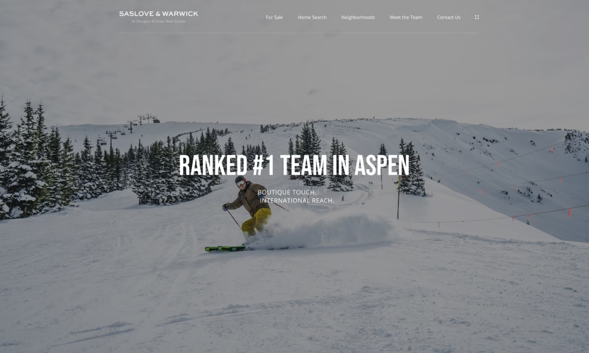
Saslove & Warwick
Saslove & Warwick, with a #1 ranking in Aspen and over $4B in total sales, have created a website that exudes modernity and elegance. The incorporation of eye-catching photography and stunning properties further elevates the website’s aesthetic. The minimalist and clean design conveys a timeless sophistication and reinforces their elevated brand.
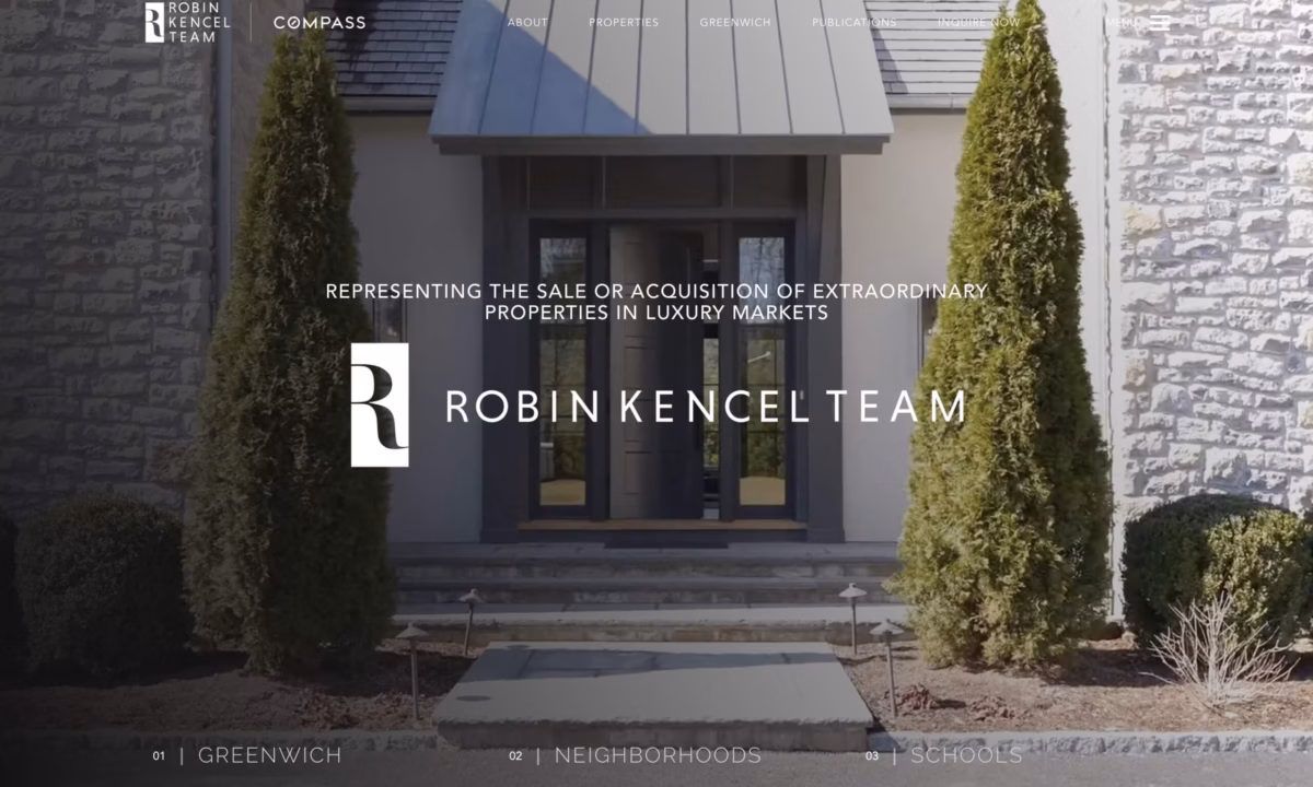
Robin Kencel Team
The Robin Kencel Team, a top performer in the real estate industry, has achieved significant success, ranking in the top 1% of agents in the Greenwich Market, top 1.5% of brokers across the USA, and top 100 agents in Connecticut. The website, with its modern and visually striking design, showcases their high-end properties and sets them apart from competitors. The website’s ultra-luxurious aesthetic further elevates the team’s brand.
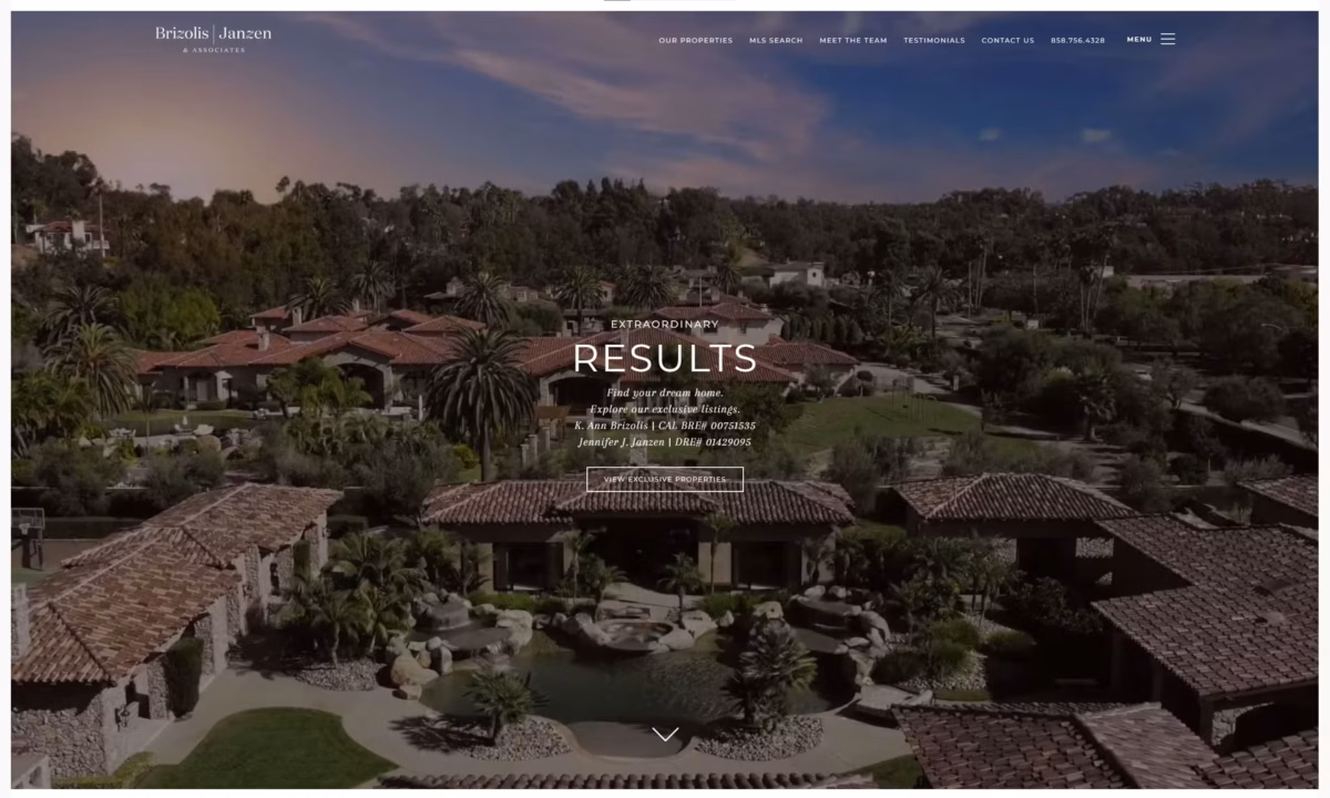
Brizolis Janzen & Associates
Brizolis Janzen & Associates, Pacific Sotheby #1 Team in San Diego, and Top 1% by America’s Best Real Estate Professionals, has achieved over $2.5B in residential sales. Their website, which boasts a modern design and subtle branding elements, exudes an upscale look. The stunning properties featured on the website are presented in a manner that conveys luxury and success, reflecting the team’s expertise and accomplishments.
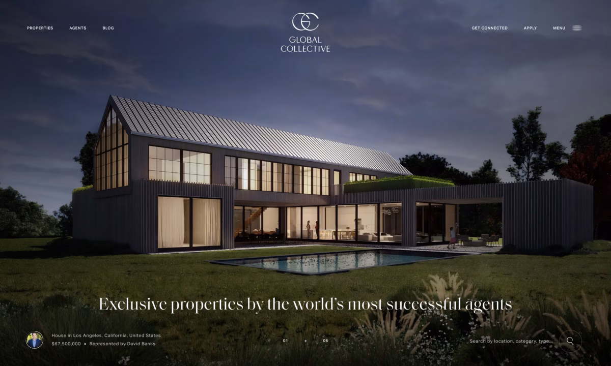
Global Collective
Global Collective™, a network of elite real estate agents and brokers, specializes in exclusive properties from some of the world’s most successful agents. With over $40B in real estate sold, they have crafted a website that exudes minimalist elegance and timeless sophistication. The modern design and visually striking imagery effectively reflect the elevated look of their properties and members.
Kumara Wilcoxon
Carolwood Partners
Ginger Martin
Village Properties
Philip Scheinfeld Team
The Fridman Group
The Fridman Group - Mobile

Carlin Wright
Carlin Wright - Mobile

Jade Mills Estates
Jade Mills Estates - Mobile

Kelly Weisfield
Kelly Weisfield - Mobile

Breitenbach Advisory
Breitenbach Advisory - Mobile

Rochelle Maize
Rochelle Maize - Mobile

David Hatef
David Hatef - Mobile

Saslove & Warwick
Saslove & Warwick - Mobile

Robin Kencel Team
Robin Kencel Team - Mobile

Brizolis Janzen & Associates
Global Collective
Global Collective - Mobile