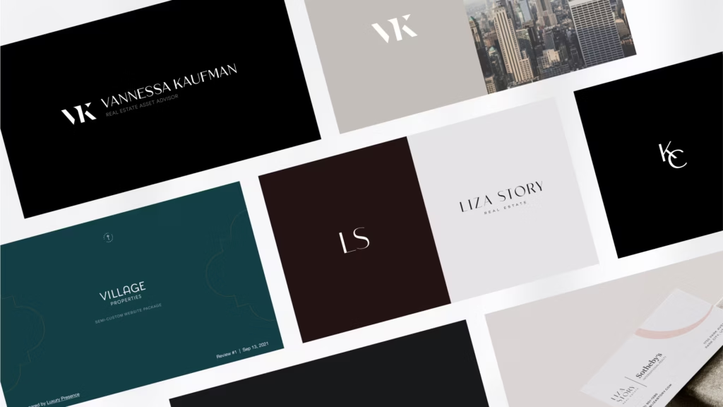
Below are 27 real logos from agents, teams, and brokerages doing real production, from a $9B-career producer to a boutique Beverly Hills brokerage, broken down by design approach.
After that: a step-by-step process for building or refining your own, what it should cost, and the file formats you'll actually need. If branding your business is on your list this year, our guide to real estate branding is a good next stop after this one.
Key takeaways
- The strongest real estate logos connect to something specific about the agent or brand, a name, a specialty, a market, rather than a generic symbol. What protects that connection: one meaningful icon (or none at all), a restricted color palette, a legible typeface, and the ability to scale down to a 32-pixel favicon without turning into a smudge.
- Black and white shows up in 20 of the 27 logos below, not because color is off-limits, but because monochrome forces every other design decision to earn its place.
- Wordmarks and monograms outperform illustrated icons for most solo agents and teams, since a name is easier to reproduce consistently across a website, sign rider, and social avatar than a hand-drawn scene.
- A logo is one visible piece of a bigger brand system. The strongest examples below pair it with a defined color palette, typography, and voice, usually documented in a brand book.
- Budget $300–$2,000 for professional freelance logo design, or $3,000–$10,000+ for full brand strategy work alongside it. DIY tools run free to $200 but come with tradeoffs (more on that below).
What makes a real estate logo strong in 2026?
Strip away the styling and every logo on this list is doing the same four jobs, in roughly this order of importance.
It connects to something real about the brand. A house silhouette or a set of keys tells a client nothing about you. Every competitor within 10 miles has access to the same clip art.
The logos below that hold up tie their symbol, or their name, or their color, to something specific: a waterfront specialty, a collaborative team structure, a market's architecture. That throughline matters more than any individual font or color choice.
Matt Breitenbach made the same case in a LinkedIn post about agents who never build their own identity: "The logo, the website, the marketing templates are all right there [at your brokerage]. Building your own takes more work, but it's the only version that's actually yours."
It's built to last longer than a trend cycle. Gradients and heavily decorative script fonts can date a brand within a couple of years. A mark tied to a real specialty or story doesn't need to chase whatever look is trending.
The logos that still look sharp years after launch, Century 21's gold mark (refreshed in 2018) and RE/MAX's red-white-and-blue balloon among them, lean on classic type and restrained color instead.
Dawn McKenna, who leads the Dawn McKenna Group, makes the same case for luxury brands generally. She points to Dior, Rolex, and YSL: they "didn't just sit on their laurels... they had brand identification. And then they evolved."

It uses color on purpose, not by default. Color is one of the fastest signals a logo sends about market position. Gold and navy read as established and high-end, while a saturated red or coral reads as energetic and modern.
The trap is picking a color because it's a favorite rather than because it matches how you want to be perceived.
Dawn McKenna picked hers for the opposite reason: a specific, unmistakable pink (Portola's "Prayer") chosen to stand apart in a field of mostly male competitors.
When her web developer warned that the shade "doesn't translate well... digitally," she held her ground: "that's what I want, because I don't want anybody else to have it. It's my thing."
That pink is now, as one Luxury Presence host put it, a cornerstone of the DMG brand. (We break down palette options with hex codes further down, and go deeper in our real estate brand colors guide.)
It's legible at any size. None of that connection matters if the mark falls apart at a 32-pixel browser tab or gets lost on a yard sign forty feet from the curb.
Simplicity is what makes a connection survive at every size, from a business card to a favicon. It isn't the point on its own.
Not every strong brand plays it this safe, either. Holly Meyer Lucas built hers the opposite way: "My real estate company, the branding is loud in its emojis and it's neon."
Her rule is simpler than any style guide: "branding to me is it should equal just being yourself in an amplified way."
Restraint is the default that works for most agents on this list. It isn't a requirement. What matters is whether the choice, quiet or loud, is actually yours.
A logo is the output of that strategy work, not a substitute for it. It's also why personal branding for real estate agents has to come before the design brief.
27 real estate logos worth studying
We grouped these by design approach rather than market, since the "why it works" reasoning tends to repeat within a category. Click through to any agent's site to see the logo in context.
Wordmarks and name-only logos
Skipping the icon entirely and putting all the design effort into typography is the most common approach among established producers, since a name is the one asset that's already unique to you.
Kumara Wilcoxon, the #1 ranked agent in Austin, Texas, with $2.5B+ in career sales, uses a black-and-white wordmark pairing a playful script with a clean serif. Name-only branding at this level of recognition works because clients are searching for her, not a company name.
Red Oak Realty, a woman-owned independent brokerage in California's Northern East Bay, pairs bold red and black with upward-sweeping serif letterforms. The color combination and forward motion set it apart from the blue-and-gold palette most competitors default to.
Jade Mills, Coldwell Banker's #1 agent with $9B+ in career sales, signs her wordmark with a script layered over a serif typeface. It reinforces that she and the brand are inseparable, a strategy that only works once you've built the recognition to back it up.
Ginger Martin + Co, a California wine country leader with $3B+ in career sales, skips the icon entirely. A refined serif typeface and generous spacing carry the whole mark, proof that a well-chosen typeface and clean layout can do the job on their own.
SERHANT., Ryan Serhant's NYC brokerage, runs deep navy with a bold all-caps sans-serif and a period at the end that reads as a full stop, authoritative and deliberate. The navy also sets it apart from the black-and-white palette used everywhere else on this list.

Saslove & Warwick, the #1 team in Aspen, Colorado, operating under Douglas Elliman with $5B+ in career closed sales, uses a classic serif with unusually generous letter spacing. The open, airy feel mirrors the landscape they sell.
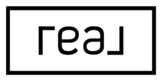
Real, a publicly traded brokerage operating across the US and Canada, sets a simple sans-serif inside a thin rectangular frame, built as a 180-degree ambigram. Read it upside down and it still says "Real." That kind of formal cleverness fits a brokerage that skipped the franchise model most legacy competitors still run on, in favor of revenue share and equity for agents.

MGS Group Real Estate, Maggie Gold Seelig's Boston-based team, skips the icon entirely and leans into a bold, wide-tracked wordmark with a trademarked line running underneath it: "Beyond Brokerage." The tagline does double duty as a positioning statement every time the logo appears, rather than sitting as an afterthought under the name.
Monograms and initials
The go-to move for teams and agents whose full name is long, hard to spell, or better represented by a shared mark. Monograms also happen to be the most favicon-friendly format on this list.
Carolwood Estates, the boutique Beverly Hills brokerage founded by Drew Fenton and Santiago Arana, uses a single serif "C." with a period at the end. That restrained punctuation signals confidence rather than needing an exclamation point.
Philip Scheinfeld Team, serving Manhattan, Brooklyn, Queens, and the Hamptons with $500M+ in career sales, arranges "PS" into a yin-yang-style shape using negative space. It's a rare case where the icon encodes a second meaning, balance, rather than plain initials.
Gregg Lynn Team, a top 3 agent team in San Francisco with $2B+ in career transactions, sets an art-deco-inspired monogram on a diagonal. The unconventional angle reads as intentional and artistic rather than off-kilter.
Rochelle Maize leads the estates division at Nourmand & Associates, with $3.5B+ in career sales. Her mark pairs bold sans-serif initials built from geometric shapes with a lighter-weight tagline underneath, geometry that nods to the architectural quality of the properties she sells.
Robin Kencel Team, among the top 100 agents in Connecticut covering Greenwich and Fairfield counties, pairs a classic serif with a custom half-formed "R." The incomplete letterform is a small piece of symbolism most viewers will notice on a second look.
Kelly Jo Gonzalez, a Texas Hill Country relocation specialist, uses a flowing script monogram built from continuous, unbroken lines, a subtle nod to a smooth client experience from first call to closing.

First Team, a Southern California brokerage that's been in business since the 1970s, pairs a blocky, condensed "FT" with a two-line wordmark, both set in white against a dark backdrop. Nothing about it chases a trend, which is fitting for a brand old enough to have already outlasted several.
Josh Flagg runs an interlocked double-F cipher, the kind of mark you'd expect on a fashion house's storefront, above "Josh Flagg" set in a small-caps serif with "Los Angeles" tracked out in sans-serif beneath it. It signals exactly what the rest of his site backs up: a personality-driven luxury brand first, a brokerage listing second.
The Agency reduces its mark to a single sweeping stroke that reads as an "A" without ever closing into a full letterform, set in white on a solid red square. Two colors, one shape, and it still holds up at actual favicon size, which is more than most single-letter marks can say.
Geometric and abstract marks
Fewer agents attempt this route because it's harder to get right, but the payoff is a mark that reads as more design-forward than a straight wordmark or monogram.
Collective, a network of established agents and brokers, the logo is clean, simple and classic.
Virtue Real Estate Group, serving the Las Vegas market with a strong charitable focus, builds a geometric diamond shape from an abstract pattern. It's square enough to work as a social media avatar, something most illustrated logos struggle with.
Liza Story, representing a wellness-focused development in Park City, uses a high-contrast black-and-white serif with tight letter tracking and negative space built into the letterforms. The design rewards a second, closer look instead of giving everything away at first glance.
The Entel Group, a South Florida team operating under Compass, builds its icon from interlocking geometric brackets that form an abstract "E," more maze than monogram. It reads as private and members-only, which fits a team built around Boca Raton's country-club market.
Figurative and illustrative logos
The riskiest category, since a poorly chosen symbol dates fast or looks generic, but done well, an illustrated element can telegraph a specialty no wordmark can.
Williams & Williams Estates Group specializes in architecturally significant Los Angeles properties. Its mark runs gold on a dark background with a classic serif and palm tree and architectural line work, a high-end palette that signals luxury positioning at a glance.
Annie Hagstrom, based in Naples, Florida, uses a soft pink palette, a deliberate break from the black-and-white norm, with a refined serif and a palm tree silhouette tying the mark to her geographic market.
Brad Kappel, Maryland's #1 agent for four consecutive years with $1.1B+ in career sales, runs navy and white with a classic serif, an anchor, and crossed keys. Those custom symbols signal waterfront expertise instead of a generic house icon.
Luxury Residential Management, which manages estates and condos for high-profile owners in Miami, pairs black and gold with a serif wordmark, generous spacing, and ornate decorative keys. The detail holds up because it's rarely shrunk below a business-card size.

Meyer Lucas Team, Holly Meyer Lucas's South Florida team, drops a literal lemon icon into the middle of an otherwise bold, all-caps wordmark. It's the same logo behind the quote earlier in this piece, and it makes its own case: loud and literal, the opposite of nearly everything else on this list, and still unmistakably hers.
Heritage brands, modernized
Century 21, with 14,000+ franchises worldwide, swapped its old serif for a modern sans-serif in its 2018 refresh and simplified the mark while keeping the gold-and-black palette. It's proof that a heritage brand can modernize without losing the recognition it spent decades building.
Real estate logo design trends to watch in 2026
A few patterns worth knowing before you start sketching.
Literal icons are on their way out. The house-silhouette cliché is exactly the trap this year's strongest new marks are avoiding. Brad Kappel's anchor and Philip Scheinfeld's yin-yang both tie to something specific about that brand instead of reaching for the nearest real estate clip art.
Ambigrams and reversible marks are having a moment. Real's 180-degree wordmark is the clearest example here, part of a broader shift toward logos that reveal something clever on closer inspection instead of announcing everything at first glance. Robin Kencel's half-formed "R" and Philip Scheinfeld's negative-space yin-yang do the same thing more quietly.
AI is a sketchpad, not a finished asset. Joana told us she experiments with AI art tools internally at Luxury Presence to explore directions quickly. Treat the output the same way: a fast way to test ideas, not a file you hand off to a printer. Most AI-generated logos still need a designer to fix the kerning, simplify the detail, and rebuild the mark as clean vector files.
Branding is moving down to the listing level. Some agents aren't stopping at their own mark. Eric Haskell describes treating standout properties like boutique hotels: "We will brand the property. We will create logos around the property. We'll create fonts around the property." A named, branded listing (his example: Casa Milagro) sticks in a buyer's memory in a way a street address never will.
Brand systems matter more than any single mark. The agents on this list who look most put together aren't relying on the logo to do all the work. They've paired it with a defined color palette, a typography system, and a consistent voice, usually documented in a brand book. See how Luxury Presence approached its own rebrand for a look at that process end to end.
How the 27 logos compare at a glance
| Attribute | What we found |
|---|---|
| Color | Black and white: 20 of 27. Navy: 3. Specialty colors (red, pink, gold, multicolor): 4. |
| Typography | Serif dominates, the high-end market default. Sans-serif is emerging for modern, tech-forward brands. Script pairings show up for personal-brand emphasis. |
| Symbolism | Wordmark only: 8. Monogram/initials: 9. Geometric/abstract: 4. Figurative/illustrative: 5. Heritage refresh: 1. |
| Scalability | High (holds up at favicon size): 20. Medium (needs a simplified version for small use): 7. |
The takeaway is restraint. Almost every high-performing logo here limits itself in color, symbol count, and font choices, regardless of which category it falls into.
How much does a real estate logo cost?
Costs vary widely depending on how much strategy work comes with the design (ranges below via ManyPixels' logo design cost guide):
| Option | Typical cost | Best for |
|---|---|---|
| DIY logo maker (Canva, template tools) | $0–$200 | Getting started fast on a tight budget; expect a generic result |
| Design contest / crowdsourcing platform | $130–$700 | Comparing several concepts before committing |
| Freelance designer | $300–$2,000 | Most solo agents and small teams, the range where quality and cost balance out |
| Design subscription service | $699–$1,199/mo | Agents who need ongoing design work beyond just the logo |
| Branding agency | $3,000–$10,000+ | Brokerages and teams that want full brand strategy alongside the mark |
As a rule of thumb, if your logo needs to last five-plus years and appear on everything from your sign rider to your website header, it's worth staying above the $300 floor.
Under that, you're usually paying for a template with your name swapped in, which is fine for a placeholder but not for the mark you'll build a business around.
How to design your own real estate logo (or refine an existing one)
1. Get your brand strategy in writing before you touch a design tool. Who's your ideal client? What do you want them to feel before they've even talked to you? A logo can't answer questions your brand strategy hasn't answered first. Our guide to real estate branding walks through that groundwork, and these 22 branding ideas can help if you're starting from a blank page.
2. Decide whether your name, your team name, or a company name leads. Solo agents with strong personal recognition (Jade Mills, Kumara Wilcoxon) tend to go name-first. Brokerages usually need a shared mark that doesn't depend on one person staying in the role forever.
3. Choose a color palette that matches your positioning, not your favorite color. Gold and navy for established or luxury positioning, forest green for growth-oriented and nature-adjacent markets, a bolder coral or red for a more modern and energetic feel. Full palettes with hex codes are below, and our brand colors guide goes deeper on the reasoning behind each choice.
4. Pick a typeface built for legibility, not decoration. Serif still reads as more established. Sans-serif reads as more modern. Whichever you choose, check it at the smallest size you'll actually use it, a favicon or app icon, before you commit to it at full size.
This breakdown of real estate brand fonts covers pairings that hold up across print and digital.
Even agents who hand design off to a team stay close to calls like this one. Dawn McKenna still reviews every font and color choice herself: "Do you like the font? Yes, but I don't like that shade of pink."
5. Sketch and test in black and white first. Every logo on this list would still work if you removed the color. If yours falls apart without it, the composition needs more work before color gets added back in.
6. Stress-test it at real-world sizes. Shrink it to a 32-pixel favicon. Drop it on a dark background. Print it in grayscale. If any version turns into mush, simplify before you finalize.
7. Decide DIY vs. AI generator vs. freelancer vs. agency based on what's actually at stake. A DIY tool works for a scrappy first pass you plan to revisit in a year. An AI generator can speed up concept exploration, but budget for a designer to turn the winning direction into clean, properly kerned vector files.
A freelancer is the right call for most solo agents and teams. An agency makes sense once you're building, or rebuilding, a full brand system: colors, type, voice, and logo, all together.
That's the approach Roh Habibi took when Luxury Presence's design team asked what fonts and colors he wanted for his rebrand. Instead of dictating specifics, he handed over a brief and trusted the process: "I'm not a like, oh my God, I want crazy bells and whistles and just fancy colors." His entire brief: "super elegant and refined."
8. Build out the full file kit. A single image file won't cover everything you need:
- SVG for your website; scales without any quality loss
- PNG with a transparent background for email signatures, digital documents, and social overlays; keep a version at least 1,000px wide
- EPS for print (signage, business cards); needs at least 300 DPI at final print size
- A horizontal version for your website header and letterhead, and a square or stacked version for social avatars and app icons. Most platforms (Instagram, Facebook, LinkedIn) crop to a square, so test your mark in a circle before you finalize it.
9. Document it in a brand book so it stays consistent. Once the logo is final, write down the exact colors (with hex codes), approved typefaces, and usage rules: what backgrounds it can sit on, minimum size, clear space around it. Here's how to build that out, and it'll save you from "which version of the logo is the real one" confusion the next time you or a vendor needs a file.
Choosing a color palette for your real estate logo
A few starting points, with hex codes, based on the positioning each is best suited for.
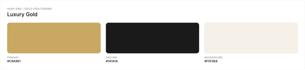
High-end / gold positioning
- Primary: Luxury Gold #C9A961
- Anchor: Deep Charcoal #1A1A1A
- Background: Warm White #F5F0E8
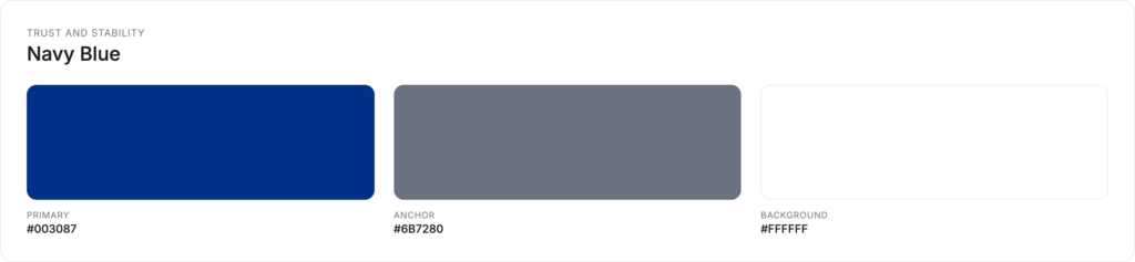
Trust and stability
- Primary: Navy Blue #003087
- Anchor: Slate Gray #6B7280
- Background: Clean White #FFFFFF
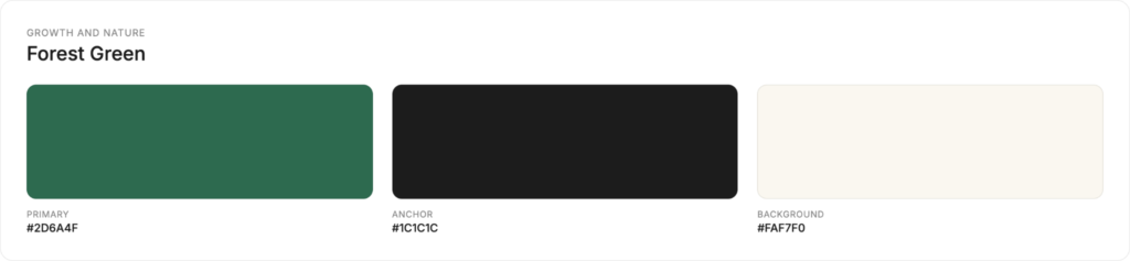
Growth and nature
- Primary: Forest Green #2D6A4F
- Anchor: Warm Black #1C1C1C
- Background: Cream #FAF7F0
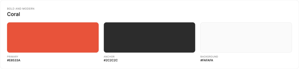
Bold and modern
- Primary: Coral #E8533A
- Anchor: Graphite #2C2C2C
- Background: Off-White #FAFAFA
Color choices pay off outside of formal branding, too. Tricia Lee's biggest transaction to date traces back to a color she posted about, not a listing: Hunter Green paint in her own kitchen, at a time when "everyone's kitchen was white or gray." That post led to a private conversation that turned into a $4M sale.
Build a brand that matches your logo
Ask a room of agents what "brand" means, and the answer is almost always the same. At a Luxury Presence panel alongside Tracy Tutor and Nile Lundgren, Kyle Scott says people always lead with "my logo, my typeface, my colors."
His response: those things matter, but "at the end of the day, all of you got this," meaning trust and human connection are what actually close deals, not the visual identity on its own.
A great logo raises expectations. If your website, listing photography, and social presence don't live up to it, the mismatch is more noticeable than if you'd never upgraded the logo at all.
That's the gap Shannon Gillette's team closed when they paired a refreshed brand with a rebuilt digital presence. A 2.6x jump in website traffic and a 91% lead reply rate followed, a case study covered in our real estate branding guide.
If you're mapping out what "a brand that matches the logo" actually requires, it usually touches:
- A real estate website that carries your colors, type, and photography consistently from the homepage to the listing pages. See examples from top-performing agent sites, or how different builders' design capabilities stack up in our Agent Image vs. REW vs. Luxury Presence comparison
- SEO and AI search visibility so the brand you built actually gets found
- Social media management and paid ads that reuse the same visual system instead of drifting from it post by post
- An AI-powered CRM so every follow-up email and text still sounds and looks like you
You can see the full range of what that looks like in practice in our case studies, or book a demo to talk through what a refreshed brand and website could look like for your business.
FAQs
Ready to grow?
Turn your content into your best lead source
See how Luxury Presence helps agents turn website visits into closed deals