Your real estate logo is one of the most visible pieces of your brand in 2026. It appears on your website, your yard signs, your social media profiles, your business cards, and every listing presentation you deliver. A strong logo communicates who you are, what you stand for, and why a client should trust you with one of the biggest financial decisions of their life. A weak one blends into the noise of a crowded market. Whether you are building a brand from scratch or refreshing a look that no longer reflects your business, the 22 real estate logos featured in this guide offer clear, practical lessons you can apply right now. Each one is broken down by color, typography, symbolism, and scalability so you can see exactly what makes it work and bring those same principles to your own brand.
Find It Fast
Key takeaways
- The most effective real estate logos in 2026 share four traits: a limited color palette, readable typography, purposeful symbolism, and the ability to scale across print and digital formats.
- Black and white remains the dominant color scheme among top-producing agents and teams, appearing in 18 of the 22 logos featured in this guide.
- Monograms, initials, and name-based logos outperform complex illustrations because they are easier to reproduce at small sizes and faster for clients to recall.
- Every logo should exist in at least two versions: a horizontal format for website headers and letterhead, and a square or stacked format for social media profile images.
- Color choices should align with your market position. Gold and navy signal high-end service, while bold colors like coral or orange signal energy and approachability.
- Before designing anything, define your brand identity, your values, and the feeling you want clients to associate with your name.
What makes a great real estate logo in 2026?
A great real estate logo does not try to say everything about your business. It communicates one clear impression, and it does so consistently across every surface where your personal brand appears. From bold and modern to classic and timeless, there are many directions you can take your logo. The principles below apply to all of them.
- Define your brand identity first
- Before you open a design tool or hire a designer, write down your brand values, the clients you serve, and the feeling you want people to associate with your name. Your logo should reflect those answers, not the other way around.
- Keep it simple
- Stick to one or two colors and a clean, easy-to-read font. An uncluttered design is easier to remember and more likely to hold up over time. Research from the Nielsen Norman Group confirms that simpler visual marks are recognized faster and recalled more accurately across digital interfaces (Nielsen Norman Group, 2023).
- Make it yours
- Avoid generic clip art, stock house icons, or anything that looks like it could belong to another agent in your market. Your logo should be identifiable as yours at a glance.
- Design for longevity
- Trendy gradients, neon colors, and overly decorative fonts may feel fresh now but can look dated within a few years. The logos that age best rely on clean lines, classic typefaces, and restrained color palettes.
- Use symbolism with intention
- Icons associated with real estate, such as houses, keys, or rooflines, can work well when they are rendered in a way that feels distinct. A generic house outline will not set you apart, but a custom-drawn symbol tied to your market or name can become a powerful brand asset.
- Use negative space
- Negative space (the empty area around and between elements in a design) creates visual breathing room and can add a layer of meaning. Several of the logos in this guide use negative space to embed hidden initials or symbols.
- Create multiple versions
- A horizontal logo may look great on letterhead or at the top of your real estate website, but it will not fit inside a square social media profile image. Design both a wide version and a stacked or square version from the start.
- Experiment with typefaces and colors
- Try several font and color combinations before committing. Small changes in weight, spacing, or hue can shift the entire personality of your logo from approachable to authoritative or from modern to classic.
Logo file formats and size specifications
Once your logo is designed, make sure you have it saved in the right formats for every use case. Here are the file types and dimensions you should request from your designer in 2026:
- SVG: Use for all web applications. SVG files scale to any size without losing quality, making them the best choice for websites and digital ads.
- PNG (transparent background): Use for digital documents, email signatures, and social media overlays. Export at a minimum of 1000px wide for web use.
- EPS: Use for print applications including signage, business cards, and mailers. Request a minimum of 300 DPI at the final print size.
- Profile image dimensions (as of 2026): Instagram requires 320x320px, Facebook displays at 170x170px on desktop, and LinkedIn uses 400x400px.
- Horizontal and square versions: Horizontal logos work on website headers and letterhead. Square or stacked versions work on social media profile images and app icons. Have both ready before you launch.
22 examples of the best real estate logos
Visual references are one of the fastest ways to sharpen your own branding instincts. The 22 real estate logos below come from high-performing agents, teams, and companies across the country. Each entry includes a four-part breakdown covering color, typography, symbolism, and scalability so you can see exactly what makes the design effective and apply those lessons to your own brand.
1. Kumara Wilcoxon

Kumara Wilcoxon is the number one ranked agent in Austin, Texas, with more than $2.5 billion in career sales as of 2026. She has access to some of the city’s most coveted properties, many of which are never listed publicly.
Why this logo works
- Color: Black and white only, which reads cleanly at any size and on any background.
- Typography: A playful script paired with a clean serif creates contrast without sacrificing legibility.
- Symbolism: The logo relies entirely on name recognition, appropriate for an agent whose name is already widely known in her market.
- Scalability: The horizontal wordmark works on business cards, letterhead, and website headers without modification.
2. Carolwood Estates
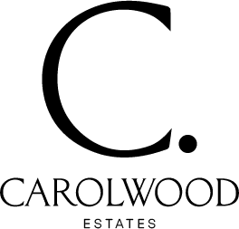
Carolwood Estates is a boutique brokerage based in Beverly Hills, founded through a collaboration of highly successful real estate professionals.
Why this logo works
- Color: A monochromatic black-and-white palette keeps the focus on the letterform itself.
- Typography: A single serif letter “C” with a full-stop period adds weight and gravitas to the mark.
- Symbolism: The period after the letter signals confidence and finality, suggesting the brokerage’s agents approach their work with seriousness and conviction.
- Scalability: The square-friendly shape works equally well as a social media avatar, a favicon, or a print watermark.
3. Red Oak Realty
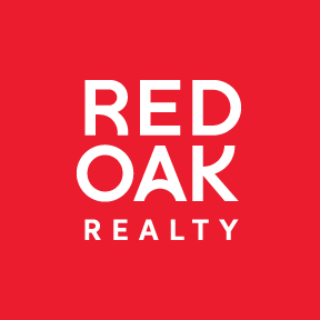
Red Oak Realty is a woman-owned independent real estate brokerage with a long-standing presence in Northern California’s East Bay.
Why this logo works
- Color: A bold red-and-black combination commands attention and differentiates the brand from the blue and gold logos common in the Bay Area market.
- Typography: Strong, upward-sweeping letterforms give the wordmark a sense of momentum and energy.
- Symbolism: A subtle nod to the brokerage’s original tree logo creates continuity for long-time clients while signaling a fresh direction.
- Scalability: The compact, square-friendly shape reproduces well on signage, social media, and print materials.
4. Jade Mills
Jade Mills has a global reputation as one of the top real estate agents in Los Angeles and Beverly Hills. She is Coldwell Banker‘s number one agent as of 2026, working with high-profile clients across the entertainment and business worlds. Her career sales exceed $9 billion.
Why this logo works
- Color: Black and white keeps the mark timeless and allows it to pair with any marketing material or listing presentation.
- Typography: A script that evokes a personal signature sits above an attractive serif font, blending warmth with authority.
- Symbolism: The signature-style script signals that the brand is inseparable from the person behind it, reinforcing name recognition.
- Scalability: The horizontal layout fits website headers and email signatures, though a stacked version would add versatility for social media.
5. Ginger Martin + Co
With over $3 billion in career sales as of 2026, Ginger Martin has established herself as a leading agent in California’s wine country.
Why this logo works
- Color: A neutral black-and-white palette lets the typography do all the work and pairs well with property photography.
- Typography: A refined serif font communicates understated confidence without competing for attention.
- Symbolism: No icon or symbol is used. The logo proves that a well-chosen typeface and clean layout can carry a brand on their own.
- Scalability: The horizontal wordmark scales down cleanly for business cards and up for signage without losing legibility.
6. Williams & Williams Estates Group
Williams & Williams is a real estate agency in Los Angeles that focuses on architecturally significant, one-of-a-kind properties.
Why this logo works
- Color: Gold on a dark background signals high-end positioning and immediately separates the brand from black-and-white competitors.
- Typography: A classic serif typeface reinforces the traditional, estate-level feel of the brand.
- Symbolism: Palm trees and architectural elements woven into the mark capture the essence of Los Angeles and the types of properties the group represents.
- Scalability: The detailed illustration works well at larger sizes on signage and print materials, though a simplified version would improve small-format reproduction.
7. Gregg Lynn Team
Gregg Lynn is consistently ranked among the top three agents in San Francisco, with more than $2 billion in career transactions as of 2026.
Why this logo works
- Color: Black and white keeps the focus on the distinctive monogram (a design that uses two or more letters combined into a single mark).
- Typography: Art deco-inspired lines (a geometric, decorative style from the 1920s and 1930s) give the initials a sense of history and craftsmanship.
- Symbolism: The diagonal orientation of the “GL” monogram breaks from conventional vertical alignment, making the mark feel artistic and intentional.
- Scalability: The monogram works stacked or placed to the left of the full name, giving the team flexibility across formats.
8. Philip Scheinfeld Team
Philip Scheinfeld runs a top-rated real estate team with over $500 million in career sales across Manhattan, Brooklyn, Queens, and the Hamptons as of 2026.
Why this logo works
- Color: A monochromatic black-and-white scheme gives the mark a gallery-like quality that fits the New York City market.
- Typography: A clean sans-serif font beneath the monogram keeps the overall design balanced and modern.
- Symbolism: The “PS” initials are arranged to suggest a yin-yang shape, evoking balance and harmony through negative space.
- Scalability: The square monogram doubles as a standalone icon for social media profiles and app icons.
“Your brand isn’t your logo or the firm that you hang your license at. It’s your reputation amongst the brokerage community.”
— Roh Habibi, Real Estate Agent
That perspective from agent Roh Habibi is worth keeping in mind as you study these logos. The best mark in the world cannot replace the reputation you build through your work. But a well-designed logo gives that reputation a visual home, something clients can recognize and remember long after the transaction closes.
9. Century 21

Century 21 is an internationally recognized real estate brand with more than 14,000 independently owned and operated franchises worldwide as of 2026.
Why this logo works
- Color: The gold-and-black color scheme has been a hallmark of the brand for decades, and the updated version retains that recognition while feeling more current.
- Typography: A modern sans-serif typeface replaces the older serif version, giving the brand a cleaner, more contemporary feel.
- Symbolism: By removing the roofline and seal from earlier versions, the redesign signals that the brand is evolving while staying rooted in its heritage.
- Scalability: The simplified mark reproduces well at every size, from mobile app icons to building signage.
10. Rochelle Maize
Rochelle Maize serves as executive director of the estates division at Nourmand & Associates. She focuses on multi-million-dollar Beverly Hills homes and has more than $3.5 billion in career sales as of 2026.
Why this logo works
- Color: Black and white keeps the mark versatile and allows it to sit comfortably alongside the Nourmand & Associates brand.
- Typography: A bold sans-serif font for the initials contrasts with a lighter weight for the tagline, creating visual hierarchy.
- Symbolism: The “RM” initials are built from strong geometric shapes and negative space, making the mark feel architectural. Her tagline reinforces confidence and authority.
- Scalability: The square monogram works as a standalone icon, while the full lockup with tagline works on larger formats.
11. SERHANT.
After a decade leading one of New York City’s top-ranked real estate teams, Ryan Serhant launched the brokerage that bears his name. In 2026, it is one of the most followed real estate brands in the world.
Why this logo works
- Color: A deep navy conveys stability and trust, setting the brand apart from the black-and-white logos that dominate the market.
- Typography: A bold, all-caps sans-serif font makes the name impossible to miss in any context.
- Symbolism: The period at the end of the name acts as a punctuation mark of authority, similar to Carolwood Estates’ approach but applied to a full word rather than a single letter.
- Scalability: The wordmark travels well across social platforms, website headers, and physical signage without any modification.
12. Global Collective
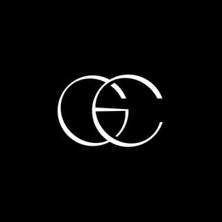
Global Collective is a network of well-known real estate agents and brokers with broad reach and deep knowledge of the communities they serve.
Why this logo works
- Color: A monochromatic palette keeps the focus on the letterform and avoids visual clutter.
- Typography: A refined serif typeface communicates tradition and credibility.
- Symbolism: The overlapping “G” and “C” create a single, interlocking mark that visually represents the idea of collaboration and connection.
- Scalability: The square-friendly shape works well as a social media avatar and a print watermark.
13. Robin Kencel Team
The Robin Kencel Team handles high-end properties in Connecticut’s Greenwich and lower Fairfield counties. Robin Kencel is among the top 100 agents in Connecticut and the top 1.5% of agents nationwide as of 2026.
Why this logo works
- Color: Black and white gives the mark a clean, editorial quality that matches the refined Connecticut market.
- Typography: A classic serif font for the full name pairs with the custom letterform to balance creativity with readability.
- Symbolism: A half-R letterform represents both exclusivity (only part of the letter is revealed) and Kencel’s first name, making the mark clever and memorable.
- Scalability: The horizontal layout works on website headers and listing materials, and the half-R can stand alone as an icon.
14. Saslove & Warwick
Ranked the number one real estate team in Aspen, Colorado, Saslove & Warwick has 60 years of combined experience and over $5 billion in career closed sales as of 2026. The team operates under Douglas Elliman.
Why this logo works
- Color: Black and white matches the clean aesthetic of the Douglas Elliman parent brand.
- Typography: A serif typeface with generous letter spacing creates an open, airy feel that mirrors the Aspen landscape.
- Symbolism: No icon is used. The team name alone carries the brand, supported by the visual harmony with the brokerage’s existing identity.
- Scalability: The slim horizontal format fits website headers and email signatures, though a stacked version would improve social media use.
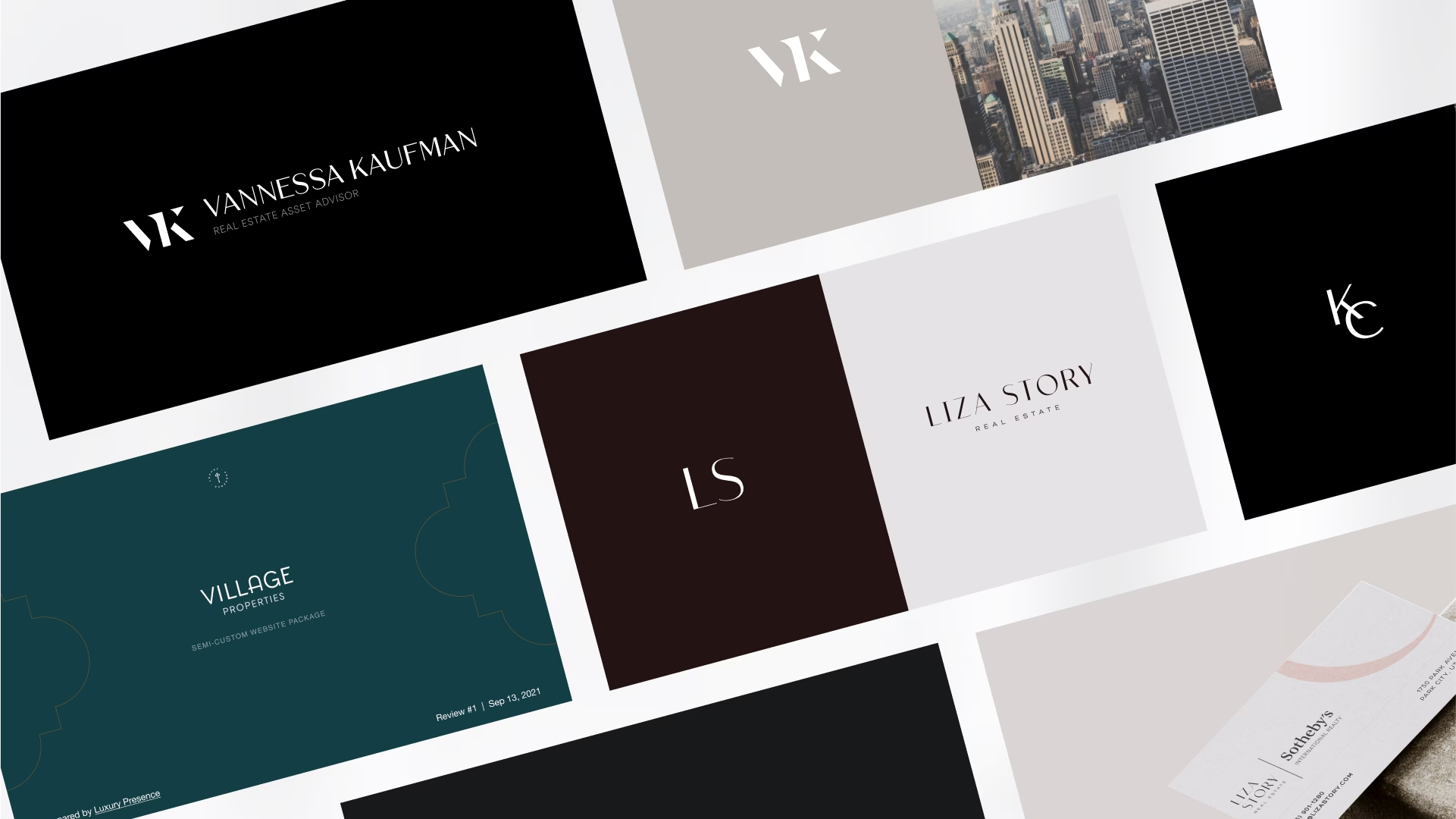
15. Liza Story
Nicknamed “the Park City ambassador,” Liza Story leads the sales team for the Velvaere wellness-focused development, representing high-end ski condos and estate homes.
Why this logo works
- Color: High-contrast black and white gives the mark a bold, editorial presence.
- Typography: A clean serif font with tight tracking creates a sense of precision and intention.
- Symbolism: Negative space within the letterforms adds visual depth and rewards a closer look, reflecting Story’s tagline: “Luxury is an experience, not a price point.”
- Scalability: The horizontal wordmark scales well for website headers and print collateral.
16. Kelly Jo Gonzalez
Representing the Texas Hill Country, Kelly Jo Gonzalez is one of the area’s leading relocation specialists, working with a wide range of clients from corporate professionals to expatriates.
Why this logo works
- Color: Black and white keeps the monogram versatile across all marketing channels.
- Typography: A flowing script monogram creates a warm, approachable feel that matches Gonzalez’s relocation-focused practice.
- Symbolism: Continuous, unbroken lines in each letter hint at a smooth, connected experience from first call to closing day.
- Scalability: The monogram works as a standalone icon at small sizes, while the full horizontal lockup works on larger formats.
17. Annie Hagstrom

After trading Canadian winters for Florida sunshine, Annie Hagstrom has built a successful real estate career in Naples.
Why this logo works
- Color: A soft pink palette breaks from the black-and-white standard and creates a warm, distinctive first impression.
- Typography: A refined serif font balances the playfulness of the color with a sense of professionalism.
- Symbolism: A palm tree silhouette ties the brand directly to the Naples, Florida, market and makes the logo instantly recognizable as a coastal brand.
- Scalability: The horizontal layout works well on website headers, though the detailed palm frond may lose clarity at very small sizes.
18. Virtue Real Estate Group
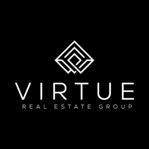
Virtue Real Estate Group (VRE Group) is a recognized name in the Las Vegas real estate market, known for strong client service and involvement in local charitable initiatives.
Why this logo works
- Color: Black and white gives the geometric mark a clean, modern feel that matches the Las Vegas market’s contemporary architecture.
- Typography: A sans-serif font beneath the icon keeps the overall design grounded and readable.
- Symbolism: An abstract geometric pattern within a diamond shape suggests both forward motion and community integration.
- Scalability: The square diamond shape works perfectly as a social media avatar and app icon.
19. Brad Kappel

Brad Kappel is a leading real estate professional with over $1.1 billion in career sales as of 2026. He has been ranked the number one agent in Maryland for four consecutive years and serves clients across the Chesapeake Bay region.
Why this logo works
- Color: A navy-and-white palette signals trust and stability, fitting for a waterfront market where buyers are making significant investments.
- Typography: A classic serif font reinforces the traditional, estate-level positioning of the brand.
- Symbolism: An anchor and crossed keys communicate waterfront expertise without relying on generic house icons or wave illustrations.
- Scalability: The horizontal lockup works on website headers and print materials, and the anchor-and-keys icon can stand alone at smaller sizes.
20. Luxury Residential Management
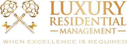
Luxury Residential Management (LRM) provides estate and condo management services for high-profile clients with second homes in Miami.
Why this logo works
- Color: Black and gold together signal high-end service and align with the brand’s focus on estate-level property management.
- Typography: A serif typeface with generous spacing creates an open, refined feel.
- Symbolism: Ornate, decorative keys are a classic real estate symbol rendered here in a style that conveys both tradition and attention to detail.
- Scalability: The detailed key illustration works best at medium to large sizes. A simplified version of the keys would improve reproduction on business cards and small digital formats.
21. Real
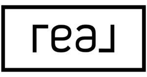
Real is one of the fastest-growing publicly traded real estate brokerages, with agents in 47 U.S. states, Washington, D.C., and Canada as of 2026. The company’s technology-first approach has attracted thousands of agents looking for a modern brokerage model.
Why this logo works
- Color: Black and white keeps the mark clean and adaptable across the company’s digital-first marketing channels.
- Typography: A simple sans-serif font inside a thin rectangular frame gives the logo a modern, tech-forward feel.
- Symbolism: The logo is an ambigram (a design that reads the same when rotated 180 degrees), which reinforces the company’s identity as a forward-looking, non-traditional brokerage.
- Scalability: The rectangular frame and simple letterforms reproduce well at any size, from mobile app icons to conference banners.
22. Beacham & Company

Beacham & Company is the only real estate company in Atlanta with an in-house photography department, reflecting a deep commitment to visual marketing and client service.
Why this logo works
- Color: A monochromatic black-and-white scheme creates a clean, editorial look that lets the shield emblem stand out.
- Typography: A serif typeface with wide letter spacing gives the wordmark a sense of heritage and permanence.
- Symbolism: A shield emblem signals stability and trust, two qualities that matter deeply to buyers and sellers in a competitive metro market like Atlanta.
- Scalability: The horizontal layout works on website headers and print materials, and the shield can function as a standalone icon for smaller formats.
How to compare all 22 real estate logos at a glance
The table below compares all 22 logos across four design attributes to help you identify patterns in what makes a real estate logo work across different markets and brand positions.
| Brand / Agent | Primary color | Typography style | Symbol used | Scalability |
| Kumara Wilcoxon | Black & white | Script + serif | Name only | High |
| Carolwood Estates | Black & white | Serif | Letter C with period | High |
| Red Oak Realty | Red & black | Bold sans-serif | Stylized tree reference | High |
| Jade Mills | Black & white | Script + serif | Signature-style name | High |
| Ginger Martin + Co | Black & white | Serif | None | High |
| Williams & Williams | Gold & black | Serif | Palm trees + architecture | Medium |
| Gregg Lynn Team | Black & white | Art deco | GL initials monogram | High |
| Philip Scheinfeld Team | Black & white | Sans-serif | PS monogram / yin-yang | High |
| Century 21 | Gold & black | Sans-serif | None | High |
| Rochelle Maize | Black & white | Sans-serif | RM initials | High |
| SERHANT. | Navy & white | Bold sans-serif | Name with period | High |
| Global Collective | Black & white | Serif | GC letterform overlap | High |
| Robin Kencel Team | Black & white | Serif | Half-R letterform | High |
| Saslove & Warwick | Black & white | Serif | None | High |
| Liza Story | Black & white | High-contrast serif | Negative space | High |
| Kelly Jo Gonzalez | Black & white | Script monogram | Continuous-line letters | High |
| Annie Hagstrom | Pink & white | Serif | Palm tree silhouette | Medium |
| Virtue Real Estate | Black & white | Sans-serif | Geometric diamond | High |
| Brad Kappel | Navy & white | Serif | Anchor + crossed keys | High |
| Luxury Residential Mgmt | Black & gold | Serif | Ornate keys | Medium |
| Real | Black & white | Sans-serif | Ambigram frame | High |
| Beacham & Company | Black & white | Serif | Shield emblem | High |
A few patterns stand out. Black and white dominates, appearing in 18 of 22 logos. Serif typefaces are the most common choice, especially among agents who serve high-end markets. And the logos with the highest scalability ratings tend to be the simplest, relying on clean letterforms or compact icons rather than detailed illustrations.
How to choose a color for your real estate logo in 2026
The color you choose is just as important as the design itself. Blue appears frequently in real estate logos, particularly among agents who want to signal stability and professionalism to buyers and sellers. Research from the Pantone Color Institute confirms that blue consistently ranks as the color most associated with trust and dependability across industries (Pantone Color Institute, 2024). But blue is not your only option. Agents and brokerages serving high-end markets often use gold or silver to convey wealth and success. Green is frequently associated with growth and abundance, making it a strong choice for agents in suburban or rural markets. For a bolder look, colors like coral, yellow, or orange attract attention and create a sense of energy and optimism. The key is to choose a color that aligns with your market position and the clients you serve. A bold coral might feel right for a young, energetic team in a fast-growing city, while a deep navy or charcoal might better suit an agent focused on estate-level properties.
Sample real estate color palettes with hex codes
If you are working with a designer or building your own brand kit, these four palettes give you a starting point. Each one is built around a primary color, a dark anchor, and a neutral background.
| Palette name | Primary color | Dark anchor | Neutral background | Best for |
| High-end gold | Luxury Gold (#C9A961) | Deep Charcoal (#1A1A1A) | Warm White (#F5F0E8) | Estate-level agents and brokerages |
| Trust and stability | Navy Blue (#003087) | Slate Gray (#6B7280) | Clean White (#FFFFFF) | Agents focused on professionalism and reliability |
| Growth and nature | Forest Green (#2D6A4F) | Warm Black (#1C1C1C) | Cream (#FAF7F0) | Suburban, rural, or eco-conscious markets |
| Bold and modern | Coral (#E8533A) | Graphite (#2C2C2C) | Off-White (#FAFAFA) | Young teams in fast-growing urban markets |
You can use these hex codes directly in conversations with your designer, in Canva, or in any brand style guide document. The goal is consistency: once you pick your palette, use it everywhere, from your logo to your website to your social media templates.
“I love the look of my Luxury Presence website. The staff paid attention to the details I wanted and added the features quickly. This was important since I have been in the business for many years and wanted to refresh my brand.”
— Allegra House, Real Estate Agent
That experience of refreshing a long-standing brand is something many agents face. Your logo and color palette are the foundation of that refresh, and getting them right makes every other branding decision easier.
Build a brand that matches your real estate logo
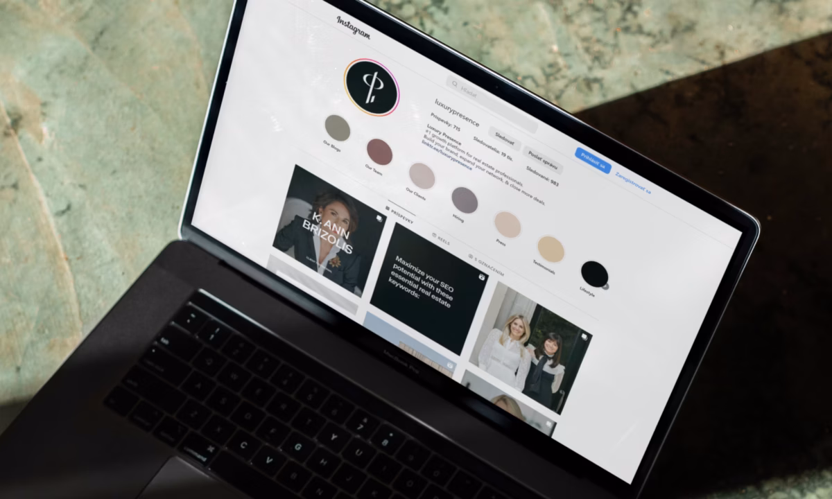
A well-designed logo is a visual anchor for your brand. It communicates professionalism, builds recognition, and gives clients something to remember you by. But a logo alone is not a marketing strategy. The agents and companies featured in this guide pair their logos with strong websites, consistent social media presence, and marketing systems that keep their brand visible between transactions. Whether you are launching a new brand around a fresh logo or building on years of name recognition, having a website and marketing system that matches the quality of your logo makes all the difference.
FAQs
Rewrite your brand strategy
Our free resources can help you define your personal brand, level up your marketing plan, and reach your target audience.
About the author
Kate Evans is a content marketing strategist at Luxury Presence, the leading growth platform for high-performing real estate professionals. She develops data-driven editorial content and supports SEO strategy and brand voice frameworks that help agents attract qualified leads and establish market authority. Her published work covers topics including CRM strategy, social media marketing, and digital growth, supporting thousands of agents in scaling their businesses through modern marketing.