
The fonts on your real estate website are doing more work than you think. Before a prospect reads a single listing description or clicks “Contact,” your typographic choices have already shaped their impression of your brand. In 2026, where agents compete for attention across websites, social media, print materials, and email campaigns, selecting the right real estate fonts is one of the most overlooked ways to build trust and stand out. This guide covers how to select, pair, and apply typography across every client-facing touchpoint so your brand reads as professional and intentional, whether someone finds you on a mobile screen or a printed brochure.
Find It Fast
Key takeaways
- Your typographic choices communicate professionalism and personality before a client reads a single word. Treat them as a brand asset, not an afterthought.
- Limit your real estate brand to two or three typefaces: one for headlines, one for body text, and an optional accent for logos or callouts.
- Test every font at multiple sizes and on multiple devices before committing. A typeface that reads well at 48px may fail at 12px on a phone.
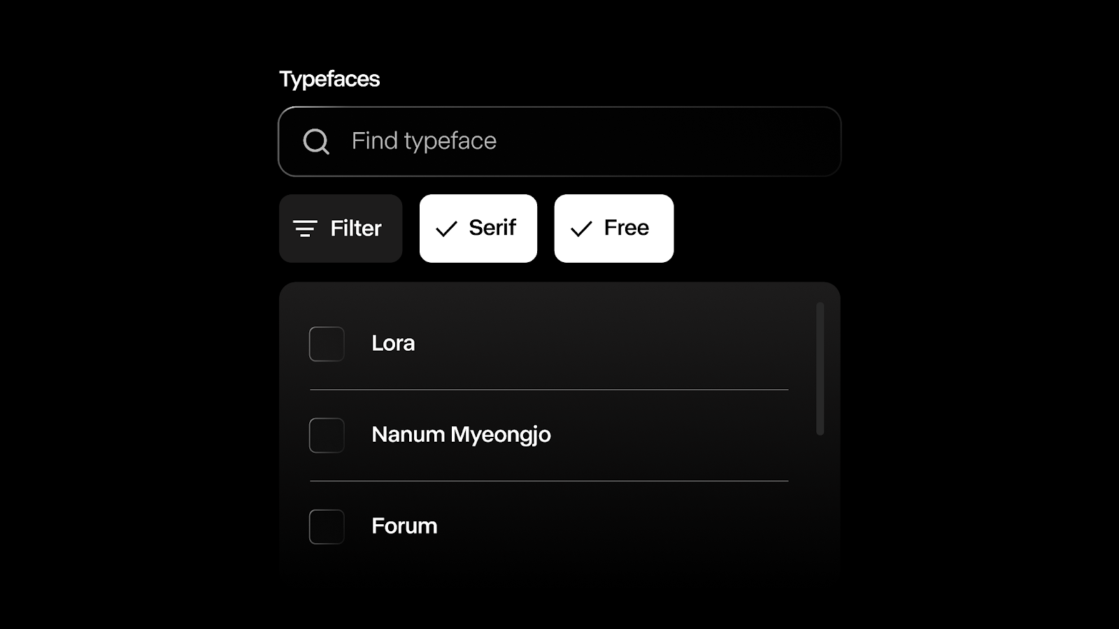
- Verify commercial licensing before using any font in client-facing materials. Google Fonts and Font Squirrel offer free commercial-use options. Adobe Fonts and MyFonts offer broader variety with paid licensing.
- In 2026, the strongest real estate typography trends lean toward minimalist sans-serifs, geometric typefaces, and restrained use of bold display fonts for headlines.
Why real estate fonts matter for your brand
Typography is not decoration. It is a trust signal. Every typeface carries a personality, whether that is clean and modern, warm and approachable, or refined and high-end. When a prospective seller lands on your website, the fonts you have chosen shape how they perceive your competence and attention to detail before they scroll past the hero image. Research from MIT’s AgeLab and the Software Usability Research Laboratory found that typeface choice directly affects perceived credibility and reading comprehension (Typography.Guru, 2024). That finding matters even more in 2026, as buyers and sellers compare multiple agent websites in a single browsing session.
If you serve the high-end market, selecting elegant fonts that signal sophistication can reinforce the caliber of properties you represent. If your focus is first-time buyers, a friendly sans-serif paired with generous spacing can make your site feel welcoming rather than intimidating. The wrong typographic choice, such as a casual or overly decorative typeface on a listing presentation, can undermine the trust you are working to build.
When your typography reinforces the same level of care you bring to pricing strategy and staging, clients notice. The right typefaces help people remember your brand and associate it with professionalism long after they close the browser tab.
The difference between font, typeface, and typography
These three terms get used interchangeably, but they mean different things. Knowing the distinction helps you communicate clearly with designers and make more informed decisions about your brand identity.
| Term | Definition | Example |
| Typeface | The overall design of a character set, including letters, numbers, and symbols. Think of it as the “family.” | Arial and Times New Roman are typefaces. |
| Font | A specific style, weight, and size within a typeface. | Arial Bold 12pt and Arial Italic 10pt are different fonts within the Arial typeface. |
| Typography | The art of arranging type to create readable, visually cohesive text. It includes layout, spacing (kerning), line height (leading), and visual hierarchy. | Pairing a bold sans-serif headline with a lighter serif body creates clear hierarchy. |
Kerning refers to the space between individual letter pairs. Leading refers to the vertical space between lines of text. Both affect how comfortable your content is to read, especially on screens. For simplicity, we will refer generally to “fonts” throughout the rest of this article.
How to choose real estate fonts in 2026

- Prioritize readability above all else. Clear, easy-to-read typefaces are non-negotiable in real estate, where clients need to scan property details, pricing, and contact information quickly. Sans-serif fonts like Helvetica (a widely used neo-grotesque typeface) and Open Sans (a humanist sans-serif available on Google Fonts) perform well on both screens and print. Save decorative or script typefaces for logos and accents only.
- Limit yourself to two or three fonts. Using too many typefaces creates visual clutter. Choose one for headings, one for body text, and an optional accent for small details like captions or taglines. Apply these consistently across your website, business cards, and promotional materials.
- Choose fonts that work across platforms. Your brand appears on your website, social media, email campaigns, and printed collateral. Not every typeface renders consistently everywhere. Using web-safe fonts or Google Fonts helps maintain a consistent appearance across devices and browsers.
- Test at multiple sizes. A typeface that looks sharp in a large headline may become illegible at 12px on a phone. Test your selections at headline, subheading, body, and caption sizes on both desktop and mobile before committing.
- Align your typographic choices with your target market. An agent serving the luxury segment might choose a refined serif like Playfair Display (a transitional serif available on Google Fonts). An agent focused on young families might lean toward a warm, rounded sans-serif like Nunito. Fonts carry cultural and psychological associations. Script typefaces can feel traditional or classic, while geometric sans-serifs often project a modern, structured sensibility (Nielsen Norman Group, 2023). Match these associations to the clients you want to attract.
- Verify licensing before you commit. Some typefaces require paid licenses for commercial use. Google Fonts and Font Squirrel offer free commercial-use options. Adobe Fonts and MyFonts provide broader libraries with paid licensing. Always review the terms before making a typeface part of your brand.
Emerging typography trends for real estate in 2026
Typography trends shift, and staying current signals that your brand is active and intentional. Here are the typographic styles and design choices gaining traction in 2026.
Minimalist sans-serifs
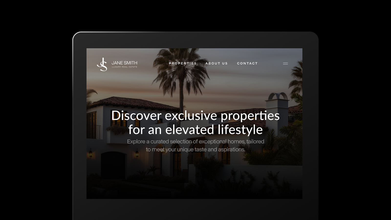
Clean, simple sans-serif typefaces remain a dominant choice for real estate brands in 2026. They project clarity and professionalism, and they perform well on websites and mobile devices where screen real estate is limited. Montserrat (a geometric sans-serif on Google Fonts) and Lato (a humanist sans-serif on Google Fonts) are two strong options for agents who want a modern look without sacrificing readability.
Handwritten and script fonts
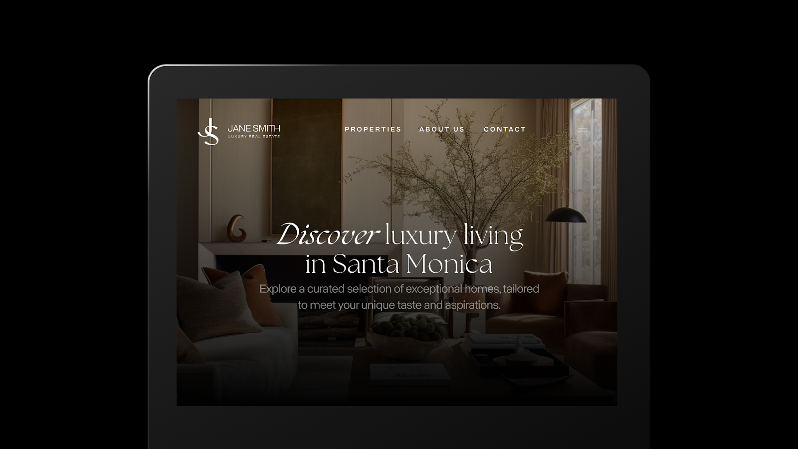
Some agents are adding script or handwritten typefaces to logos and accent elements to create a more personal brand feel. This approach works well for agents who want warmth and approachability. The key rule: reserve script fonts for accents or logos only. They become difficult to read in body text, especially at smaller sizes on mobile.
Bold, attention-grabbing fonts

Bold display typography is showing up more frequently in real estate branding, particularly for headlines and hero sections on agent websites. A heavy-weight typeface grabs attention and creates a strong visual anchor. Balance it with a lighter-weight body font so the page does not feel overwhelming. The contrast between a bold headline and a clean body typeface creates the kind of visual hierarchy that keeps visitors reading.
Geometric fonts

Geometric typefaces are built on clean lines and symmetrical shapes, which gives them a polished, architectural quality. Futura (designed by Paul Renner in 1927 and still widely licensed) and Proxima Nova (a geometric sans-serif available through Adobe Fonts and other foundries) are popular choices for real estate brands that want to project stability and forward-thinking design sensibility.
Variable and adaptive fonts
Variable fonts are a technical development worth watching in 2026. A single variable font file can adapt its weight, width, and optical size dynamically, which means your website design loads fewer files while offering more typographic flexibility. Google Fonts hosts several variable typefaces, including Roboto Flex and Inter, both of which give real estate agents fine-grained control over how text appears across different screen sizes without the performance cost of loading multiple static font files.
Tips for using typography effectively
- Maintain consistent spacing and alignment. Correct kerning, leading, and alignment give your text a polished look. Sloppy spacing signals carelessness, which is the last thing a seller wants to see from the agent marketing their home.
- Apply your fonts the same way everywhere. Use the same typeface pairings across your website, listing presentations, social graphics, email signatures, and print materials. Inconsistent font usage weakens brand recognition and makes your marketing look fragmented.
- Review your typography as your brand evolves. The typefaces you chose three years ago may no longer reflect where your business is headed. Schedule a yearly check to confirm your fonts still align with your positioning, your target market, and the platforms where your brand appears most often.
That kind of brand translation starts with typography. When your fonts, colors, and layout work together, the result is a site that feels intentional rather than assembled from templates. The details compound.
Where to find fonts
Free font sources
These platforms offer typefaces you can use in commercial projects at no cost. They are a strong starting point for agents building or refreshing a brand on a budget.
- Google Fonts: The largest open-source font library, with hundreds of typefaces including popular real estate choices like Montserrat, Lato, Open Sans, Playfair Display, and Roboto Flex.
- Font Squirrel: A curated collection of free, commercially licensed typefaces with a webfont generator for easy site integration.
- DaFont: A large library of free fonts. Check individual licensing terms carefully, as not all fonts on DaFont are cleared for commercial use.
Premium font sources
Premium libraries offer broader variety, more refined typefaces, and dedicated licensing for commercial branding. These are worth the investment if you want a typeface that fewer competitors are using.
- Adobe Fonts: Included with Adobe Creative Cloud subscriptions. Offers a deep catalog of high-quality typefaces with straightforward commercial licensing.
- MyFonts: One of the largest commercial font marketplaces, with filters for style, language support, and licensing type.
- TypeType: A type foundry offering modern, well-crafted typeface families with clear licensing terms.
- Fontspring: Known for worry-free licensing. You pay once and use the font across all your materials without recurring fees.
Whichever source you choose, confirm that the license covers your intended use: website embedding, social media graphics, print collateral, and email marketing. Getting this right upfront saves you from legal headaches later.
FAQs
Rewrite your brand strategy
Our free resources can help you define your personal brand, level up your marketing plan, and reach your target audience.
About the author
Content at Luxury Presence
Kate Evans is a content marketing strategist at Luxury Presence, the leading growth platform for high-performing real estate professionals. She develops data-driven editorial content and supports SEO strategy and brand voice frameworks that help agents attract qualified leads and establish market authority. Her published work covers topics including CRM strategy, social media marketing, and digital growth, supporting thousands of agents in scaling their businesses through modern marketing.