
Find It Fast
Key takeaways
- As of 2026, four out of five real estate website visitors arrive on a phone or tablet, making mobile responsiveness a baseline requirement rather than an upgrade.
- Search engine optimization (SEO) accounts for 53% of website traffic for real estate agents, and Google ranks mobile-friendly pages higher in its index.
- Pages that load in under two seconds see a 30% higher conversion rate than slower pages, directly affecting how many visitors fill out a contact form.
- Email marketing converts 40% better than social media for real estate, but only when messages render correctly on mobile screens.
- Simple fixes like compressing images, shortening forms, and using responsive templates can close the gap between a site that loses visitors and one that captures them.
Why mobile responsiveness matters in 2026
When a visitor taps a link to your website and the page loads slowly, text is too small to read, or buttons overlap on a small screen, they leave. That departure is measured as a bounce, which is the percentage of visitors who exit after viewing only one page. Google tracks bounce rate as a signal of page quality. A high bounce rate tells search engines your page did not satisfy the visitor, pushing your site lower in results.
“This is how we live. We do everything on our phones — we shop, we order food, we order cars, we order everything.”
— Ricardo Rodriguez, Real Estate Professional
Rodriguez’s observation captures the behavioral reality agents face in 2026. If your digital presence does not match the device your audience uses most, you lose the opportunity before a conversation ever starts. Here is what is at stake when your site is not mobile-friendly:
- Lower search rankings: Google uses mobile-first indexing, meaning it primarily evaluates the mobile version of your site when deciding where to rank you. A site that performs poorly on phones will rank lower, regardless of how it looks on a desktop.
- Higher bounce rates: Research from Google and SOASTA found that the probability of a visitor bouncing increases by 32% when page load time goes from one second to three seconds (Google/SOASTA, 2017). That data point remains a widely cited benchmark in 2026 because the underlying user behavior has only grown more impatient.
- Fewer inquiries: Organic search delivers an average conversion rate of 3.2%, compared to 1.5% for paid search (Digital Agency Network, 2026). A mobile-friendly site that ranks well in organic results captures higher-intent visitors who are more likely to fill out a contact form or schedule a showing.
How to build a responsive real estate website
Your website is often the first interaction a potential client has with your brand. Responsive design is the approach where layout, images, and text automatically adapt to different screen sizes and devices. Rather than maintaining separate desktop and mobile versions, a responsive site uses a single codebase that rearranges itself based on the visitor’s screen. Here is how to make sure your site meets that standard.
Start with a responsive template
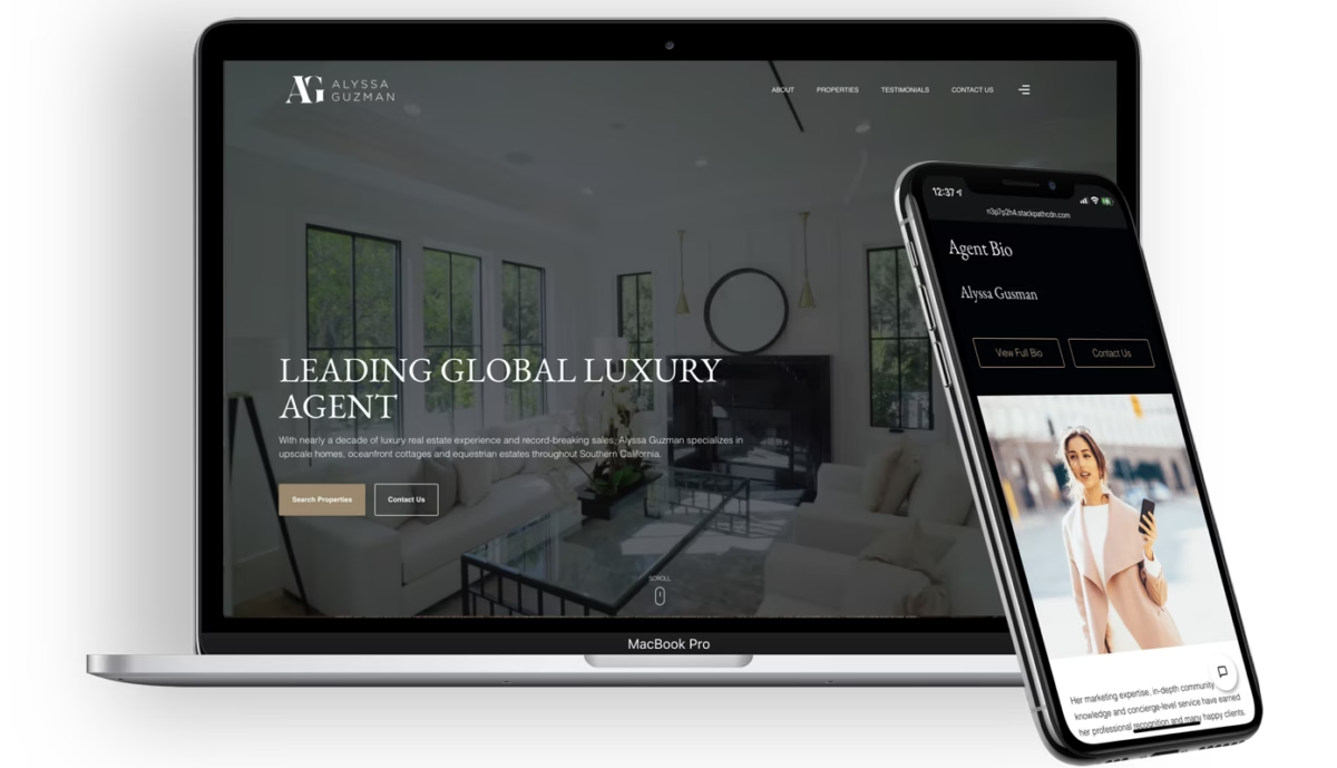
The fastest path to a mobile-friendly site is choosing a platform that handles responsiveness at the template level. Luxury Presence websites are built on responsive templates that automatically adjust to any screen size, so agents do not need to make manual adjustments for phones, tablets, or desktops. This removes the most common technical barrier and lets you focus on the content and branding that differentiate you in your market.
Keep navigation simple
Mobile users make decisions quickly. If they cannot find listings, contact information, or neighborhood details within a few taps, they leave. Keep your menu options to five or fewer top-level items and make sure every button is large enough to tap with a thumb.
- Use sticky navigation: A menu bar that stays visible as the user scrolls lets visitors jump to any section without scrolling back to the top. This reduces friction and keeps people on the page longer.
- Reduce clutter: On mobile, less is more. Remove decorative elements that do not serve a direct purpose. Prioritize IDX search, listings, and a visible contact button.
Speed matters more than design
A beautiful site that takes five seconds to load will lose visitors before they see a single photo. Target a load time of two seconds or less on mobile. Pages that hit that benchmark see a 30% higher conversion rate than slower pages. Here are two steps that make the biggest difference:
- Compress images: High-resolution listing photos are necessary, but uncompressed files slow everything down. Run images through a compression tool like TinyPNG before uploading. This reduces file size without a visible drop in quality.
- Simplify your site code: Unnecessary scripts, plugins, and third-party widgets add weight to every page load. A cleaner site loads faster. If you are on a platform like Luxury Presence, the code is already written for speed, so you do not need to audit it yourself.
Make forms short and touch-friendly
Every extra field on a contact form reduces the number of people who complete it. On mobile, where typing is slower and screens are smaller, this effect is magnified. Stick to three or four fields: name, email, phone number, and an optional message.
- Use large input fields: Small text boxes that require precise tapping frustrate users. Make each field tall enough to tap comfortably and space them apart so visitors do not accidentally select the wrong one.
- Enable auto-fill: Label your form fields with standard terms like “name,” “email,” and “phone.” Browsers recognize these labels and offer to auto-fill saved information, which cuts the time to complete a form by half or more.
Formatting content for mobile screens
Even with a fast, responsive site, the way you present content determines whether visitors stay or scroll past. Mobile screens are narrow, and attention spans are short. Every paragraph, heading, and image needs to earn its place.
Write short paragraphs with clear headings
On a phone, a paragraph that looks reasonable on a desktop can fill the entire screen. Break your content into blocks of two to three sentences. Use descriptive headings and subheadings so visitors can scan the page and jump to the section that matters to them.
- Use bullet points: Lists are easier to scan than dense paragraphs. Whenever you present steps, features, or comparisons, format them as a list.
- Set readable font sizes: Body text should be at least 16 pixels, and headings should be 22 to 24 pixels. These sizes follow Material Design typography guidelines and prevent users from needing to pinch and zoom. Stick to web-friendly typefaces like Arial, Helvetica, or Georgia for maximum readability on small screens.
Put the most important information first
Mobile visitors often skim. Place your contact information, call-to-action (CTA) buttons, and key listing details near the top of every page. Do not make someone scroll through three screens of text before they find your phone number.
- Contact info above the fold: Your phone number, email, and a link to your contact form should be visible without scrolling on every page of your site.
- CTAs that stand out: Use a contrasting color for your CTA buttons and keep the text short. “Schedule a Showing” or “Get a Home Valuation” tells the visitor exactly what happens when they tap.
Use visuals that load fast and display well
Photos and video are the most valued features on real estate websites. A 2026 survey found that 41% of buyers rated photos as the most useful website feature, followed by 39% who cited detailed property information (Homes.com/YouGov, 2025). Listings with video generate 403% more inquiries than those without. Make sure your images are compressed, your videos are embedded rather than self-hosted, and every visual element scales correctly on mobile.
Making real estate emails work on mobile in 2026
Email remains one of the highest-performing channels for real estate agents. Between 50% and 60% of all emails are opened on a phone (AudiencePoint, 2023), which means your message needs to look right on a small screen or it will be deleted in seconds.
Choose mobile-friendly email templates
Keep subject lines short
Mobile email clients often cut off subject lines after 35 to 40 characters. Place the most compelling words at the beginning. “New Listing: 4BR in Westlake” works better than “Check Out This Amazing New Listing We Just Added in the Westlake Neighborhood.” According to Litmus, 2024, front-loading the subject line with the most relevant detail increases open rates on mobile by up to 15%.
Make the email scannable
Apply the same rules you use for website content. Short paragraphs, bold text for key details, and bullet points for lists. If your email includes a CTA button, make it at least 44 by 44 pixels so it is easy to tap with a thumb.
Mobile optimization checklist
Use this table as a quick reference when auditing your site, content, and emails for mobile readiness in 2026.
| Area | Action | Target benchmark |
| Website speed | Compress all images and remove unnecessary scripts | Under 2-second load time on mobile |
| Responsive design | Use a template that adapts to all screen sizes | No horizontal scrolling on any device |
| Navigation | Limit top-level menu items and add sticky nav | 5 or fewer menu items |
| Contact forms | Reduce fields and enable auto-fill | 3 to 4 fields maximum |
| Font size | Set body text to 16px minimum | No pinch-to-zoom needed |
| CTA buttons | Use contrasting color and descriptive text | Minimum 44x44px tap target |
| Email templates | Use single-column, responsive layout | Renders correctly on iOS and Android |
| Email subject lines | Front-load the most relevant detail | 35 to 40 characters or fewer |
| Listing visuals | Compress photos and embed video | Images under 200KB each |
FAQs
Expert website design services
Every day, Luxury Presence creates and manages real estate websites for some of the biggest agents, teams, and brokerages in the country. Learn how we can transform your online presence.
About the author
Kate Evans is a content marketing strategist at Luxury Presence, the leading growth platform for high-performing real estate professionals. She develops data-driven editorial content and supports SEO strategy and brand voice frameworks that help agents attract qualified leads and establish market authority. Her published work covers topics including CRM strategy, social media marketing, and digital growth, supporting thousands of agents in scaling their businesses through modern marketing.