Real estate brand colors directly shape how clients perceive your credibility, market position, and professionalism before they ever read a word on your website. In 2026, where the majority of buyers and sellers start their property search online, your color palette is one of the fastest signals a prospect uses to decide whether you are worth their time. The right real estate brand colors communicate trust, authority, and the kind of experience a client can expect from working with you. The wrong ones create confusion or, worse, make you forgettable. This guide breaks down the psychology behind color choices, what the top-performing agents get right about their palettes, and how to build a brand book that keeps your visual identity consistent across every channel.
Find It Fast
Key takeaways
- Up to 90% of a first impression is based on color alone, which means your palette is doing more branding work than your tagline or headshot.
- Each color sends a specific psychological signal: blue conveys trust, black signals sophistication, green communicates growth, and red creates urgency.
- Most strong real estate brands use three to five colors total, with one or two primary colors and two to three supporting accents.
- Bold colors like red and yellow work best as accents rather than dominant elements, since overuse can feel aggressive or overwhelming.
- Your brand book should document every color with its Hexadecimal (HEX), Red Green Blue (RGB), Cyan Magenta Yellow Key (CMYK), and Pantone values to keep application consistent across digital and print.
- In 2026, agents who match their color palette to their target market segment, whether that is high-end residential, first-time buyers, or commercial, stand out faster than those who pick colors based on personal preference alone.
Why you should prioritize color in your branding
Your color palette is the first thing a prospect registers when they land on your website, scroll past your social post, or pick up your business card. It happens before they read your name, your bio, or a single listing description. Color is the entry point to your brand.
As a real estate agent, you are not just marketing properties. You are marketing trust, expertise, and a lifestyle. Your personal brand is what separates you from every other agent in your market. It is what gives a potential client the confidence to hand you the keys to one of the biggest financial decisions of their life.
As of 2026, more buyers and sellers begin their real estate journey online than through any other channel. That means your digital presence is often the only impression you get to make. From your logo and website to your social media profiles and signage, every visual element should reflect a cohesive, polished brand image. Your brand colors sit at the center of that visual identity.
The right colors make you more memorable. They attract the clients you actually want to work with. They give you a competitive edge that goes beyond your sales numbers. Your real estate brand colors should communicate your value and align with the audience you want to reach.
When your color palette is paired with a clear brand strategy, it positions you as the go-to agent in your market. That positioning matters more in 2026 than ever, because the visual impact of your online presence can be the difference between a prospect clicking on your profile or scrolling right past it.
How color psychology shapes real estate brand perception in 2026
Colors are powerful communicators that shape emotions, create associations, and influence decision-making, often without the viewer being consciously aware of it.
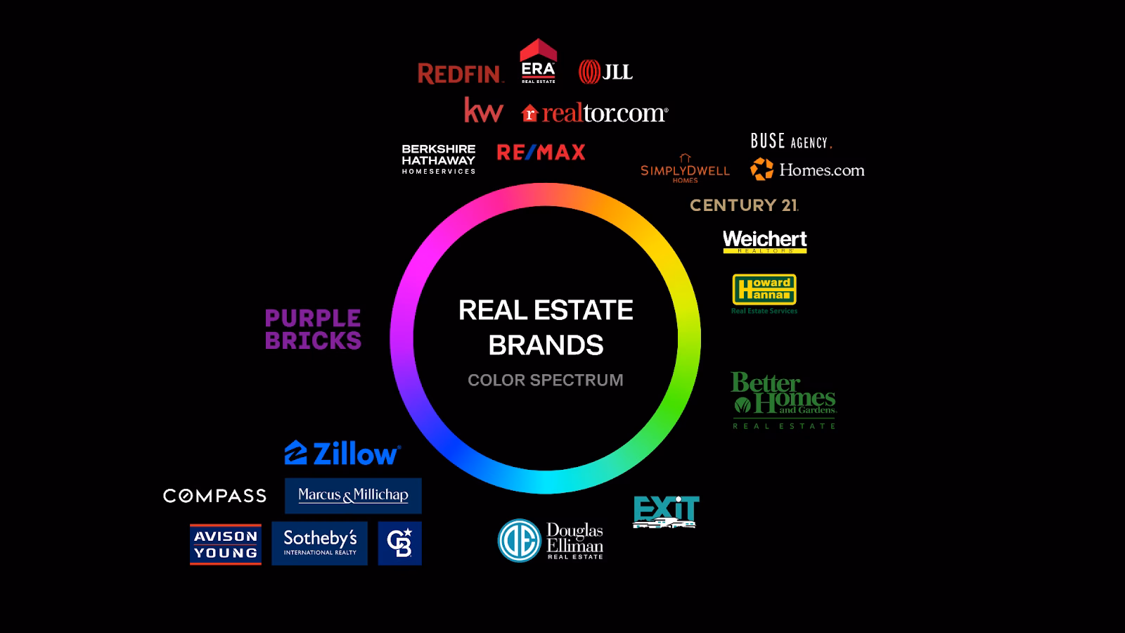
At Luxury Presence, we work with 30% of the WSJ RealTrends Top 100 agents. One pattern is consistent across the highest-performing brands: their color palettes are deliberate, documented, and applied without exception across every digital and print touchpoint. These agents do not pick colors on a whim. They treat color as a strategic branding decision with direct business impact.
For real estate professionals, the question is not “what color do I like?” but “what do I want my brand to say before a client reads a single word?” Blue signals trust. Black signals sophistication. Green signals growth. Red signals urgency. Each color carries a psychological weight, and the agents who understand that weight build brands that attract the right clients faster.
What different real estate brand colors mean
Choosing your brand colors is not about personal preference. It is about understanding the psychological impact that different colors have on the human brain and aligning those signals with the message you want your brand to send. Here is a breakdown of the most common colors used in real estate branding, what they communicate, and when to use them.
| Color | Primary associations | Best use in real estate | Use with caution |
| Blue | Trust, stability, professionalism | Broad-market agents, brokerages, teams | Can feel generic if not paired with a distinctive accent |
| Green | Nature, growth, harmony, prosperity | Eco-friendly markets, suburban, coastal | Darker greens read as financial, lighter greens as casual |
| Red | Energy, urgency, boldness | Accent color for CTAs, high-energy brands | Overuse feels aggressive or alarming |
| Black and gray | Sophistication, authority, elegance | High-end residential, architectural properties | All-black palettes can feel cold without a warm accent |
| Yellow | Optimism, warmth, approachability | First-time buyer brands, community-focused agents | Overuse feels overwhelming or hard to read on screen |
| Pink | Warmth, compassion, friendliness | Approachable brands, lifestyle-focused agents | Too much can feel overly playful or less formal |
| Purple | Creativity, wealth, prestige | High-end properties, agents signaling a premium experience | Deep purples can feel heavy without lighter accents |
Blue

Blue is the most widely used color in real estate branding, and for good reason. It is associated with trust, stability, and professionalism. These are the exact traits clients look for when choosing an agent to guide them through a major financial decision. SERHANT., one of the most recognized brokerages in the industry, uses blue as a core brand color to reinforce reliability and competence across every touchpoint.
Green
Green communicates nature, growth, harmony, and prosperity. It is a strong choice for agents who want to signal sustainability, balance, or a connection to the outdoors. Green evokes feelings of calmness and safety, making it well-suited for agents working in eco-friendly, suburban, or coastal markets. Island House Real Estate uses green to reinforce its connection to natural, waterfront living.
Red

Red is bold, energetic, and attention-grabbing. It conveys excitement and urgency, which is why it works well as an accent color for calls to action on websites and marketing materials. Red Oak Realty uses red as a defining brand element that signals energy and decisiveness. The key with red is moderation. Use it to draw the eye to specific elements rather than as a dominant background color, since too much red can feel aggressive.
Black and grays
Black communicates sophistication, elegance, and exclusivity. It is a go-to choice for high-end real estate brands that want to signal a premium experience. The Philip Scheinfeld Team uses a clean black monogram to project authority and refinement. Gray, as a supporting neutral, adds balance and professionalism without overpowering the palette. Together, black and gray create a foundation that reads as polished and confident.
Yellow
Yellow is optimistic and cheerful. It conveys warmth and positivity, which can humanize your brand and make you appear more approachable. Williams and Williams uses yellow to create a welcoming, community-oriented brand identity. Like red, yellow is best used in moderation. Too much yellow on a screen can feel overwhelming or make text difficult to read.
Pink
Pink evokes warmth, compassion, and approachability. It creates a welcoming atmosphere that works well for brands focused on lifestyle, community, or a client-first experience. Annie Hagstrom uses pink to project a friendly, modern brand identity that stands apart from the sea of blue and black in her market. The balance point with pink is tone: softer, muted pinks read as sophisticated, while brighter pinks can feel less formal depending on your audience.
Purple
Purple is associated with creativity, wealth, and prestige. It is a strong choice for agents who specialize in high-end properties or want to signal a premium client experience. Berkshire Hathaway HomeServices uses purple as its signature color, reinforcing the brand’s association with established wealth and trust. Deep purples pair well with gold or cream accents for a palette that reads as both authoritative and inviting.
Color palettes by market segment
The best real estate brand colors are not just psychologically sound. They are matched to the specific market segment you serve. Here are three palette frameworks you can use as a starting point, each designed for a different audience.
High-end residential
A high-end residential palette should communicate sophistication and exclusivity. Start with black (#000000) as your primary color, pair it with a warm gold accent (#C9A96E), and use white (#FFFFFF) as your background. This combination signals prestige without feeling cold, and it translates well across digital, print, and signage.
Approachable residential and first-time buyers
For agents working with first-time buyers or family-oriented markets, the palette should feel warm, trustworthy, and inviting. A navy blue (#1B3A6B) primary paired with a warm off-white (#F5F0E8) and a sage green accent (#7C9A7E) creates a brand that feels both credible and welcoming. This palette works especially well for agents who want to project reliability without the formality of a black-and-gold scheme.
Modern commercial
Commercial real estate branding benefits from a palette that reads as sharp, forward-looking, and professional. Charcoal (#36454F) as the primary color, paired with an electric blue accent (#0066CC) and a light gray (#E8E8E8) background, creates a clean, modern identity. This combination signals competence and precision, which are the qualities commercial clients prioritize when selecting a broker.
How to incorporate color in your brand book
A brand book is a documented guide that outlines every element of your visual and messaging identity, including your logo, fonts, imagery style, and color palette. Every real estate agent who is serious about building a recognizable brand needs one.
Your brand book ensures consistency across all your marketing materials, from your website to your social media posts to your print collateral. Consistency is what builds recognition. When a client sees your business card, visits your website, or scrolls past your Instagram post, they should recognize your brand instantly. The fastest path to that recognition is consistent use of your brand colors across every channel.
Maria’s point reinforces why documenting your colors matters. Without a system, your branding drifts. A team member uses the wrong shade of blue on a flyer. A vendor prints your logo in a color that does not match your website. Small inconsistencies add up, and they erode the recognition you have worked to build.
When selecting your brand colors, consider how they will perform across different mediums: digital screens, printed materials, and physical signage. You should also think about accessibility and how your colors will be perceived by people with color vision deficiencies. A palette that looks striking on a monitor may lose contrast on a printed page or become indistinguishable for someone with red-green color blindness.
Your brand book’s color palette section should include both primary and secondary colors, along with their exact specifications. That means documenting codes for Hexadecimal (HEX), which is used for web design. Red Green Blue (RGB), which is used for digital screens. Cyan Magenta Yellow Key (CMYK), which is used for print production. And Pantone values, which ensure exact color matching across vendors and materials. This level of detail prevents the kind of color drift that weakens brand recognition over time.
What to include in your color palette documentation
- One to two primary brand colors with all four color codes (HEX, RGB, CMYK, Pantone)
- Two to three secondary or accent colors with the same specifications
- One to two neutral colors (white, off-white, gray, or black) for backgrounds and text
- Usage guidelines that specify which colors are used for headlines, body text, backgrounds, buttons, and accents
- Accessibility notes showing minimum contrast ratios for text-on-background combinations
2026 color trends in real estate branding
Color trends shift every year, and agents who pay attention to those shifts can keep their brands feeling current without overhauling their entire identity. In 2026, several patterns are shaping how real estate professionals approach their palettes.
The Pantone Color of the Year continues to influence design and branding conversations across industries, including real estate. Warm neutrals and earthy tones have gained traction in recent Pantone announcements, reflecting a broader cultural shift toward warmth, comfort, and authenticity. For agents, this means that palettes built around warm whites, soft creams, and grounded earth tones feel especially current in 2026. Colors like Cloud Dancer (PANTONE 11-0601), a warm off-white, pair well with deeper accent colors and give digital properties a clean, modern feel.
Beyond Pantone, three broader trends are worth noting for real estate branding in 2026:
- Muted over saturated. Agents are moving away from bright, saturated palettes toward softer, more muted tones that feel sophisticated and calming on screen. This is especially true for agents targeting higher price points.
- Warm neutrals as primary colors. Where white and cool gray once dominated real estate websites, warm neutrals like cream, sand, and taupe are now being used as primary background colors. They add warmth without competing with property photography.
- Intentional accent colors. Rather than using three or four bold colors, the strongest 2026 brand palettes use one carefully chosen accent color against a neutral foundation. This creates a cleaner visual hierarchy and makes the brand easier to recognize at a glance.
The key principle here is not to chase trends for their own sake. Instead, use trend awareness to pressure-test your existing palette. If your colors still feel current and aligned with your market, keep them. If they feel dated or disconnected from the clients you want to attract, a thoughtful refresh can make a measurable difference in how your brand is perceived.
Choosing Brand Colors That Build Trust
The strongest real estate brand colors do more than make your marketing look polished. They help you signal trust, attract the right clients, and create a visual identity that stays consistent across every platform. When your palette is chosen with intention and documented in your brand book, it becomes one of the simplest ways to strengthen recognition and position your business with confidence.
FAQs
Rewrite your brand strategy
Our free resources can help you define your personal brand, level up your marketing plan, and reach your target audience.
About the author
Kate Evans is a content marketing strategist at Luxury Presence, the leading growth platform for high-performing real estate professionals. She develops data-driven editorial content and supports SEO strategy and brand voice frameworks that help agents attract qualified leads and establish market authority. Her published work covers topics including CRM strategy, social media marketing, and digital growth, supporting thousands of agents in scaling their businesses through modern marketing.