According to the National Association of Realtors' 2025 Profile of Home Buyers and Sellers, 70% of buyers now use a mobile device at some point during their home search, and nearly all of them go online before they ever call an agent. If your site is slow, confusing, or hard to use on a phone, that visitor leaves before you ever get the chance to make your case.
That's what UI/UX for real estate is really about. Get it right, and your website turns visitors into leads. Get it wrong, and it quietly sends them to a competitor's listing page instead.
Real estate agent Josh Flagg put it plainly in his take on the power of a luxury real estate website: "A great website is non-negotiable for those who care about their brand and business." He's just as direct about what happens when it isn't: "A substandard website can be a significant red flag to prospects, potentially costing you valuable opportunities."
This guide covers what UI/UX for real estate actually means, the specific elements a high-converting site needs in 2026, the design trends worth paying attention to, and where agents most often get it wrong.
UI vs. UX: what's the difference, and why does it matter?
The terms get used interchangeably, but they describe two different things.
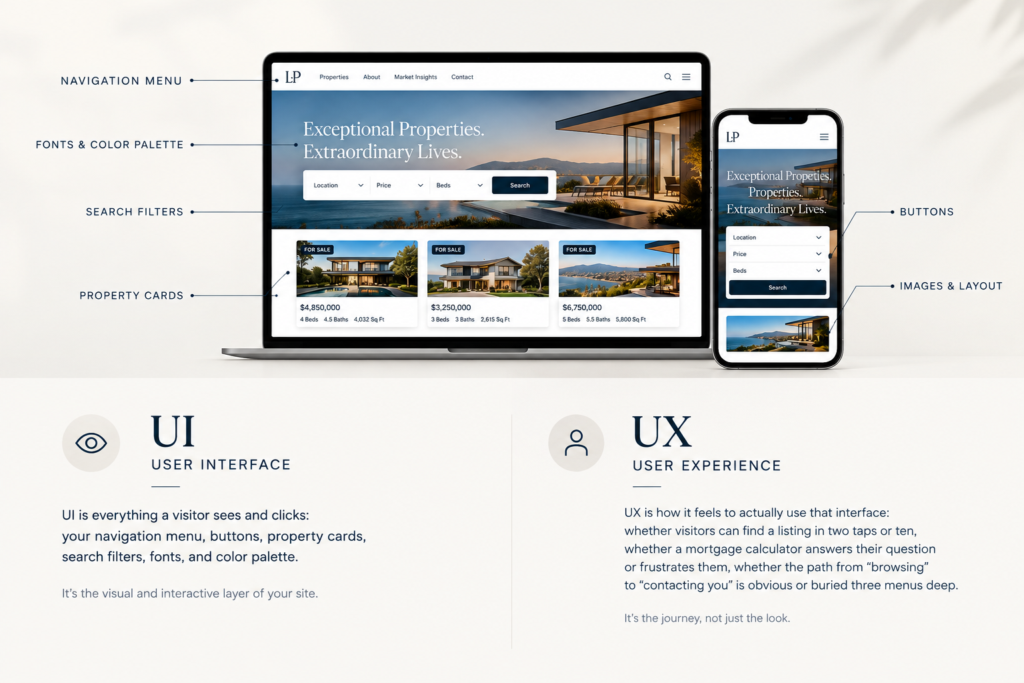
UI (user interface) is everything a visitor sees and clicks: your navigation menu, buttons, property cards, search filters, fonts, and color palette. It's the visual and interactive layer of your site.
UX (user experience) is how it feels to actually use that interface: whether visitors can find a listing in two taps or ten, whether a mortgage calculator answers their question or frustrates them, whether the path from "browsing" to "contacting you" is obvious or buried three menus deep.
Good UI without good UX is a beautiful site that's hard to use. Good UX without good UI is a functional site that doesn't inspire confidence. A real estate website built to convert needs both working together: design that reflects your brand and a structure that makes it effortless to take the next step.
Real estate agent Elena Gartz summed up why this matters in a Luxury Presence webinar on why top agents launched branded mobile apps: "Perception is everything. The highest-performing brands in any industry can control the experience." Your website's UI/UX is one of the biggest levers you have over that perception.
What UI/UX elements does a real estate website need in 2026?
Design inspiration is everywhere. What matters is whether your site includes the specific elements that get visitors from "just browsing" to "let's talk." Here's where to focus.
A mobile-first layout
With most home searches now starting or continuing on a phone, your site can't just be "responsive." It needs to be designed for mobile first and scaled up, not the other way around.
"We live in a mobile-first world," as Gartz put it in that same webinar, and a site that only works well on a laptop is designed for how agents used to browse, not how buyers actually do. That means large tap targets, a collapsible navigation menu that doesn't bury key pages, sticky call and contact buttons, and property search filters that work with a thumb instead of a mouse.
If you haven't audited your site on an actual phone recently, optimizing your funnel for mobile is one of the most effective changes you can make.
Fast, clean property search
Your IDX search is likely the most-used feature on your site, so it deserves the most attention. Visitors expect to filter by price, location, beds, and baths above the fold, switch easily between map and list views, and see results load without a spinner.
Clunky, dated IDX integrations undercut an otherwise great design, which is why the search provider you choose is itself a UI/UX decision. As Luxury Presence SEO Manager Kyle Whigham notes in his IDX SEO strategy guide, "simply having an IDX is table stakes. Every agent in your MLS has access to the same listings, the same photos, the same property descriptions.
If your IDX page looks identical to dozens of other agents' pages, Google has no reason to pick yours." The same is true for the humans looking at it. See our breakdown of the best IDX home search providers for what to look for.
Clear visual hierarchy and generous white space
The best real estate sites don't try to say everything at once. They use size, spacing, and color deliberately, so a visitor's eye goes straight to the listing photo, the price, or the call-to-action, not to five competing elements at once. Stick to one or two fonts, build around a restrained color palette, and keep your spacing consistent. That combination does more for perceived quality than any single flashy feature.
Brad Beyea has watched this go wrong the same way on page after page: "A landing page that tries to book meetings and showcase your bio and link to your blog and offer a home valuation is doing four jobs, which means it's doing none of them well," he told us in Why Your Landing Page Matters More Than Your Ads. "If you have a whole bunch of different calls to action, links everywhere, and a bio about you, it dilutes everything and makes leads more expensive."
Fast load times
Every extra second of load time is a visitor who bounces before they see anything. A site loaded with unoptimized images and unnecessary scripts will lose people no matter how good the design looks in a mockup.
Google's own PageSpeed Insights is a free way to see exactly where your site is losing time, and it's worth checking after every major update, not just at launch.
Lead capture that doesn't feel like a toll booth
Every page should make it obvious what to do next, without forcing visitors through a long form to do it. Keep general contact forms short, save multi-step forms for higher-intent actions like home valuations, and repeat your primary call-to-action throughout longer pages instead of burying it once at the bottom.
As Tracy Tutor put it in her piece on turning a real estate website into a lead generation machine, "capturing leads doesn't mean sacrificing aesthetics." Aesthetics and conversion work together, not against each other. Our guide to lead capture forms for real estate sites and our breakdown of high-converting real estate landing pages both go deeper on this.
Trust signals, placed where they're seen
Testimonials, recent sales, media mentions, and a real "About" section with your headshot and story all do quiet work convincing a visitor you're worth contacting. These elements matter most near your CTAs and on listing pages, where a visitor is closest to deciding whether to reach out.
Luxury Presence client Shannon Gillette has heard this from her own clients directly: "We researched all of the agents in your market, and because of your website, it looks so professional, so polished, we decided to call you."
Design trends shaping real estate UI/UX in 2026
Beyond the fundamentals, a few trends are showing up across the highest-performing real estate sites this year.
Interactive neighborhood exploration. Rather than a static map pin, leading sites let visitors explore schools, commute times, and local amenities directly on the listing page, giving buyers context they'd otherwise have to search for elsewhere.
Lifestyle-driven content over listing-only pages. Sites that pair property details with neighborhood guides and local storytelling are giving visitors a reason to stay and explore, rather than bounce after checking one listing.
Restrained, confident branding. Minimalist layouts, muted palettes, and clean typography continue to outperform busier, more decorative designs, particularly at the luxury end of the market, where visitors read simplicity as a signal of quality.
Accessibility as a baseline. Larger text options, sufficient color contrast, and keyboard-navigable menus aren't optional extras. They widen your audience and increasingly factor into how sites are evaluated by search engines.
AI-assisted engagement. Chat widgets that can answer basic questions about a listing or neighborhood at 10 p.m., when a live agent isn't available, are becoming a standard way to capture interest that would otherwise go cold.
What does great real estate UI/UX look like in practice?
Strong examples share a few things in common: an above-the-fold hero that leads with a clear action, a search experience that feels instant, and a path to contact that never disappears completely as a visitor scrolls.
Rather than pin everything to one site (design changes, and so do URLs), we keep an updated, browsable set of standout examples across markets and styles in our roundup of the best real estate agent websites, a useful reference when you're building a list of what you do and don't want to borrow for your own site.
Your platform choice is a UI/UX decision
The design you want and the design your website can actually support are two different things, and the gap between them usually comes down to your underlying platform. A heavily templated builder may limit how much of the above you can actually implement, while a fully custom build takes longer and costs more.
If you're evaluating your options, our comparisons of SaaS vs. traditional website providers and the best real estate website builders for agents and brokers walk through the tradeoffs so you're choosing a platform that fits the site you're trying to build, not the other way around.
Common UI/UX mistakes that quietly cost you leads
A few patterns show up again and again on underperforming real estate sites. Many bury the property search behind a generic "Listings" tab instead of surfacing it where visitors expect it. Contact forms ask for too much information too soon. Image galleries go uncompressed and load painfully slowly on mobile. A single call-to-action sits at the very bottom of a page most visitors never reach. And often, the site was designed once, launched, and never revisited, even as visitor behavior and design standards moved on.
None of these mistakes are dramatic on their own. Together, they add up to a site that looks fine in a screenshot and underperforms in practice.
How often should you revisit your site's UI/UX?
You don't need a full redesign every year. Most agents are well served by a complete design refresh every two to three years, paired with smaller, ongoing updates like a faster IDX integration, an updated lead form, or a refreshed homepage hero, whenever there's a clear reason to make one. If it's been longer than that since you've looked at your site with fresh eyes, our guide to building (or rebuilding) a real estate website in 2026 is the right place to start.
FAQs on UI/UX design for real estate
Ready to grow?
Turn your content into your best lead source
See how Luxury Presence helps agents turn website visits into closed deals